
Vision Creative
Vision Creative is a bold, people-first identity for a modern creative studio built on the belief that great ideas begin with different perspectives.
Rooted in creativity, inclusion and human potential, the brand brings together a distinctive symbol, expressive typography and a striking orange, black and white visual language.
The result is an identity that gives Vision Creative a recognisable personality of its own while remaining connected to the values behind Vision.
The project
Vision Creative was developed as a distinct visual identity for a creative studio connected to Vision and its inclusive roots.
The brand needed to express creativity in a way that felt contemporary, memorable and full of character, without losing the human values at its foundation.
Rather than focusing only on what the studio creates, the identity explores the people, ideas and perspectives behind the creative process.
The goal was to build a visual language that feels confident and independent while remaining connected to a broader belief in individual potential.
The challenge
Creating a distinct identity for Vision Creative meant finding the right balance between independence and connection.
The studio needed a recognisable visual personality that could stand confidently on its own, while still reflecting the inclusive thinking associated with Vision.
The identity also needed to be flexible enough to work across different environments, from business cards and merchandise to digital communications and large-scale signage.
The challenge was to make the brand visually bold without losing the sense of humanity and approachability at its centre.

The big idea
Creativity doesn't come from seeing everything the same way.
Different experiences, ideas and perspectives can lead to unexpected possibilities - and that became the foundation of Vision Creative's identity.
Instead of building the brand around a generic creative-industry symbol, the visual concept connects the act of seeing with the people behind the ideas.
The result is a design direction that brings together perspective, individuality and creative expression.
A simple thought sits behind the whole identity: seeing differently is what makes creating differently possible.

The idea behind the mark
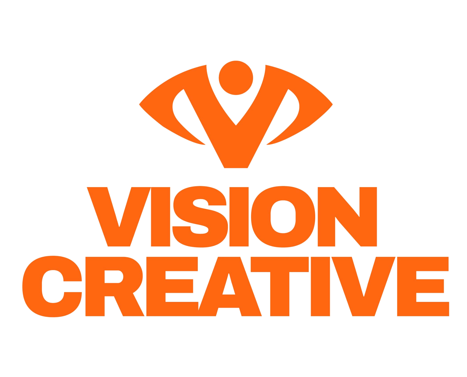
At the centre of the identity is a symbol that brings three ideas together.
The first is an eye - a direct reference to vision, perspective and the ability to see possibilities from a different point of view.
The second is the letter V, creating a recognisable connection to the Vision name and giving the mark a clear structural foundation.
The third is an abstract human figure, placing people and their creative potential at the heart of the identity.
Rather than treating these ideas as separate symbols, they are combined into one compact emblem. The result is a mark that feels bold and contemporary while carrying a deeper meaning about creativity, people and perspective.
The logo system
The Vision Creative identity was designed as a flexible system rather than a single fixed logo.
The emblem can work independently as a compact brand signature, while the complete wordmark creates a strong and direct expression of the studio's name.
Horizontal and stacked arrangements allow the identity to adapt to different spaces and formats.
The orange, black and white variations preserve contrast and recognition across different backgrounds, giving the brand consistency without restricting how it is presented.
The visual language
The Vision Creative visual language is built around strong contrast and a deliberately restrained colour system.
Vision Orange gives the identity its energy and recognisable personality, while black creates a confident foundation and white introduces clarity and breathing room.
Together, the three colours allow the brand to feel expressive without becoming visually complicated.
The result is a flexible visual system that feels modern, recognisable and consistent across applications.
Colour palette
Vision Orange
#FF6712
White
#FFFFFF
Black
#000000
People & perspective
Vision Creative's identity is built around the belief that different perspectives make creativity stronger.
That idea is reflected not only in the symbol, but also in the personality of the brand.
Rather than adopting a distant or overly corporate tone, the visual language feels expressive, open and confident.
Bold graphics create immediate impact, while the underlying concept keeps the focus on people and their ideas.
The identity celebrates creativity as something shaped by individuality, collaboration and the freedom to see things differently.
The brand values
Four connected values help define the personality of Vision Creative.
Perspective is about looking beyond the obvious and recognising the possibilities that different viewpoints bring.
Creativity is about exploring ideas and potential without allowing conventional expectations to set the limits.
Inclusion places people at the centre, recognising that individuality and different experiences contribute to the creative process.
Boldness brings everything together through a confident, expressive approach that isn't afraid to stand apart.
These values provide a consistent foundation for how the brand looks, feels and communicates.
Perspective
Different viewpoints create opportunities for stronger ideas.
Creativity
Ideas and human potential drive creative expression.
Inclusion
People and their individuality are central to the brand.
Boldness
A confident creative attitude gives the studio its distinct character.
The details
A strong identity also needs to work when the design becomes smaller and more practical.
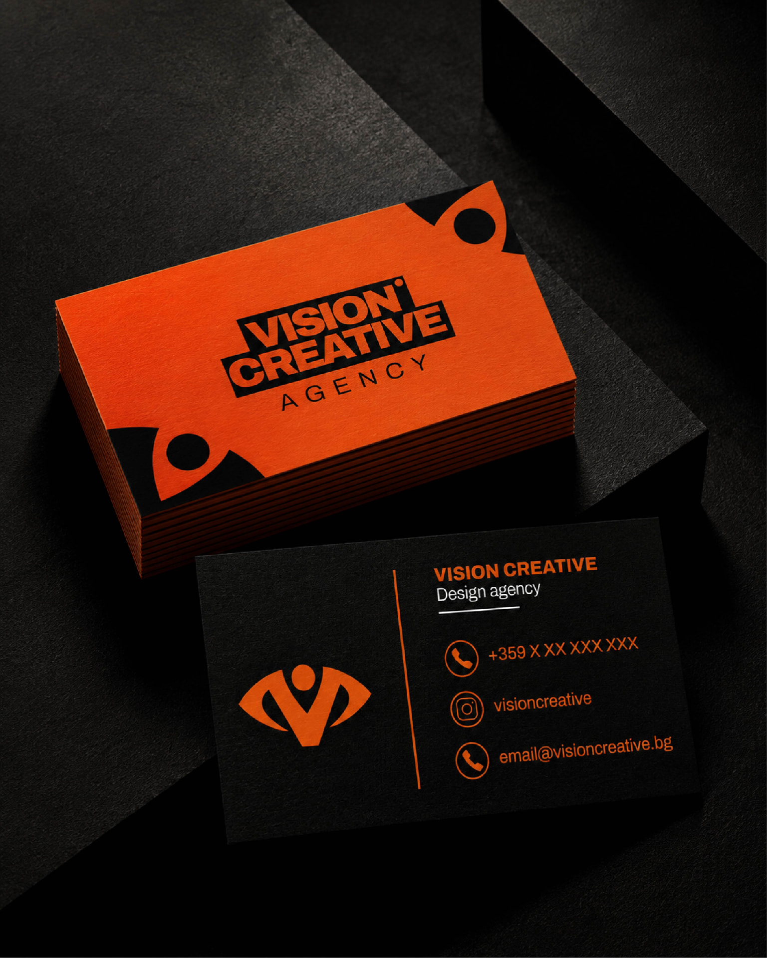
The Vision Creative business cards demonstrate how the logo, typography and colour system can be applied within a limited space without losing their character.
The contrast between orange and black creates a strong visual presence, while the structured hierarchy keeps supporting information clear.
These details help establish consistency, allowing even the smallest branded application to feel connected to the wider identity.
Beyond the logo
The visual identity was developed to extend beyond flat graphics and printed materials.
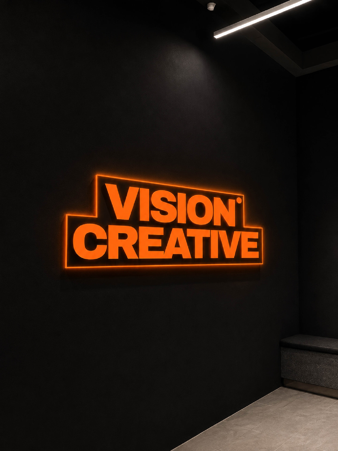
The Vision Creative symbol and wordmark were explored through illuminated signage, showing how the brand's strong shapes and signature orange can create an impactful physical presence.
The emblem works as a recognisable visual element on its own, while the complete wordmark brings the same confidence to larger applications.
These visualisations demonstrate how the system maintains its character as the scale and environment change.
The result
The final Vision Creative identity brings together a meaningful symbol, bold typography and a confident orange, black and white visual language.
The eye, the letter V and the human figure combine into a mark that represents perspective, creativity and the people behind the studio.
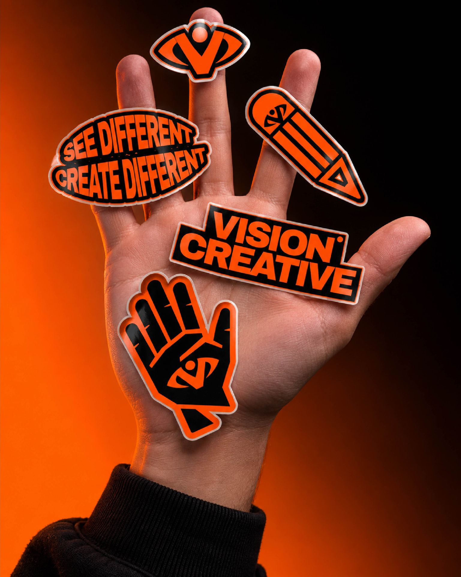
Across stickers, business cards and environmental applications, the same elements create a consistent and recognisable presence.
The result is a distinctive brand identity that gives Vision Creative its own personality while keeping human potential and different perspectives at the centre.