Melty's
Melty's was born on a sunny, carefree day when someone thought, 'What if ice cream could be as fun and messy as a kid's laughter?' Built around playful branding, cheerful flavors, and a lighthearted personality, Melty's creates a memorable experience that captures the joy, nostalgia, and excitement of enjoying your favorite frozen treat.
Overview
Melty's is a playful ice cream brand built around joy, nostalgia, and childhood memories. Inspired by the messy fun of melting ice cream on a warm summer day, the identity combines bold colors, friendly typography, and a cheerful mascot to create a brand experience that feels energetic, approachable, and full of personality.
Goal
Create a memorable and expressive ice cream brand that captures the excitement of summer, encourages emotional connection, and stands out through a fun visual identity that appeals to both children and adults.
Design Process
- 01
Researching playful food and dessert brands to understand how visual identity creates emotional engagement.
- 02
Developing a mascot-driven concept inspired by the carefree feeling of enjoying ice cream on a sunny day.
- 03
Creating a bold logo system with friendly typography and vibrant colors to reflect the brand's energetic personality.
- 04
Designing packaging and supporting brand assets that extend the playful character of Melty's across multiple touchpoints.
- 05
Refining the visual identity to ensure consistency, recognition, and a memorable customer experience.
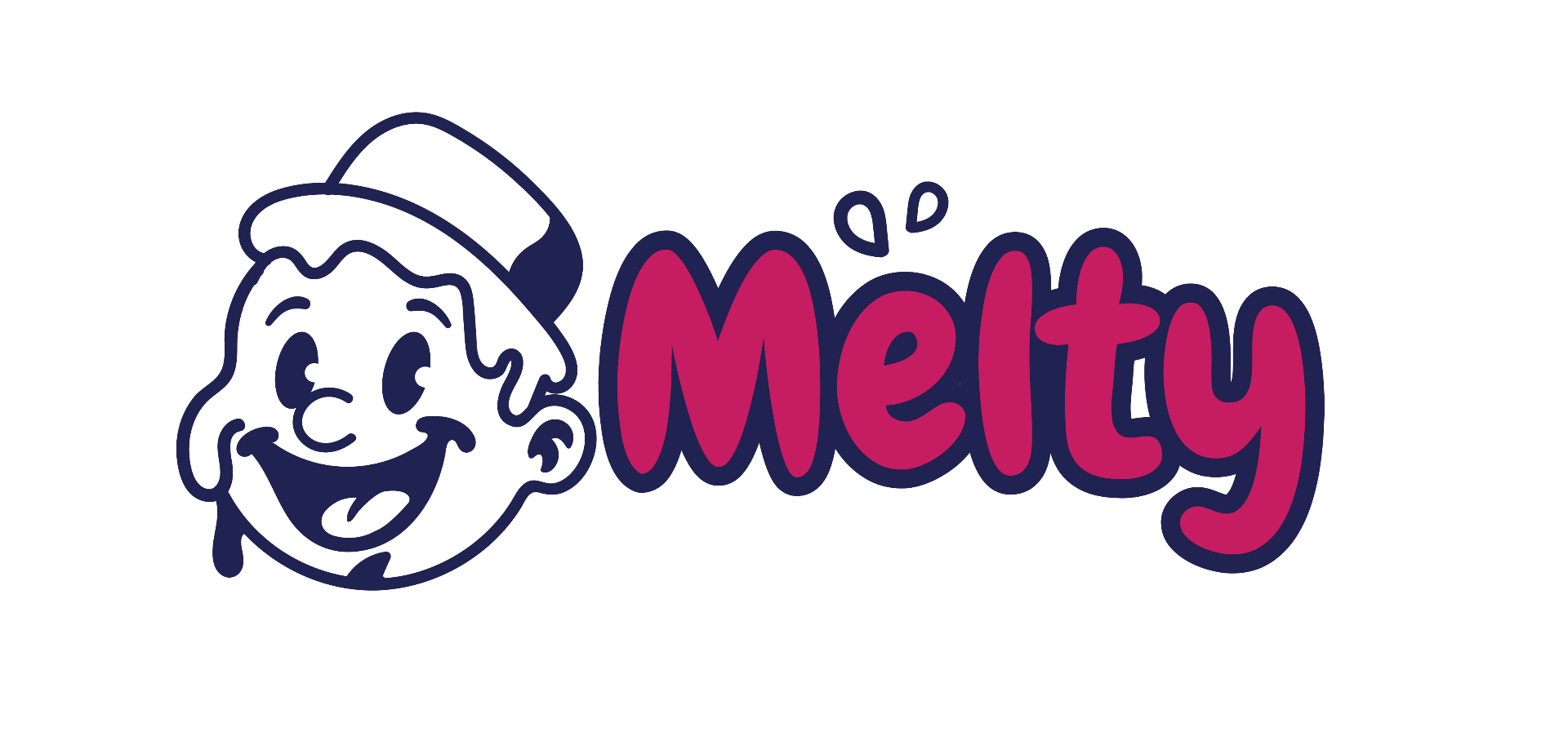
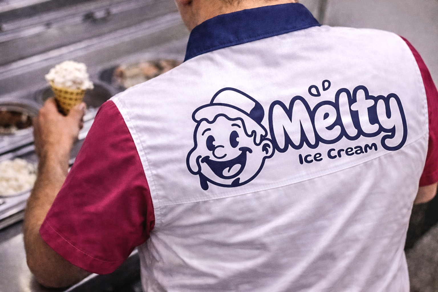
Logo / Identity
The Melty's identity system combines playful character design, bold typography, and vibrant color applications to create a fun and memorable brand experience. The logo suite is designed to remain flexible across packaging, digital platforms, merchandise, and promotional materials while maintaining strong recognition and a cheerful personality.
Color Palette
Melty Pink
#C61C61
Blueberry
#202251
Cherry Red
#A00A1C
Strawberry Cream
#F5A6C1
Typography
DISPLAY, WORDMARK & BRAND TYPOGRAPHY
Chewy Regular
Chewy Regular is used throughout the Melty's identity system, including the logo, wordmark, packaging headlines, merchandise, and key brand messaging. Its playful, rounded character reinforces the fun, nostalgic, and cheerful personality of the brand while creating a memorable and approachable visual presence.
ABCDEFGHIJKLMNOPQRSTUVWXYZ
abcdefghijklmnopqrstuvwxyz
0123456789
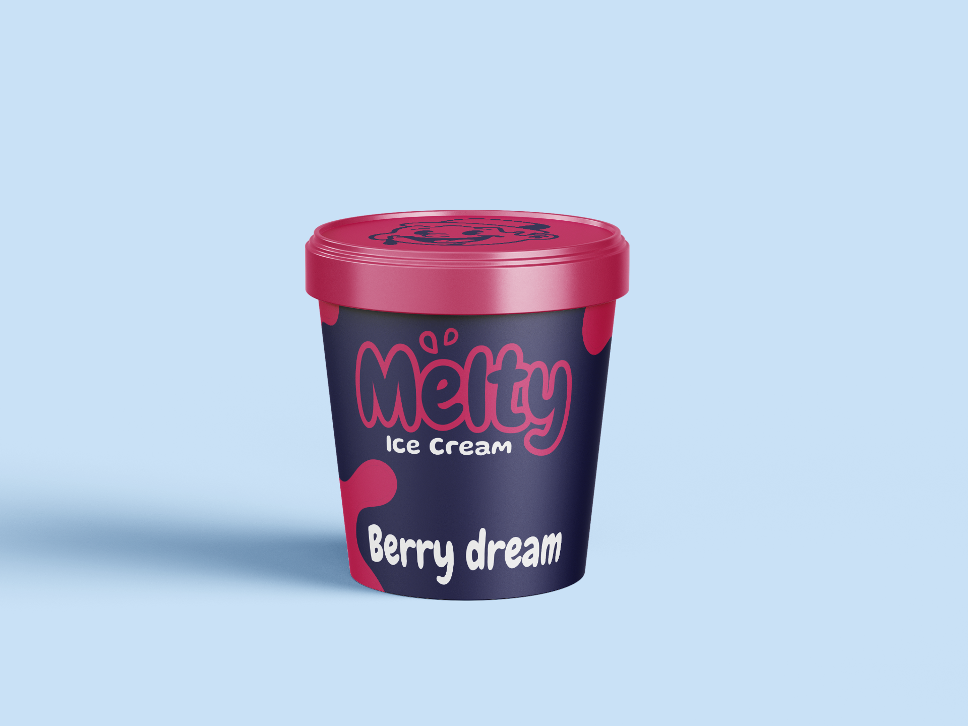
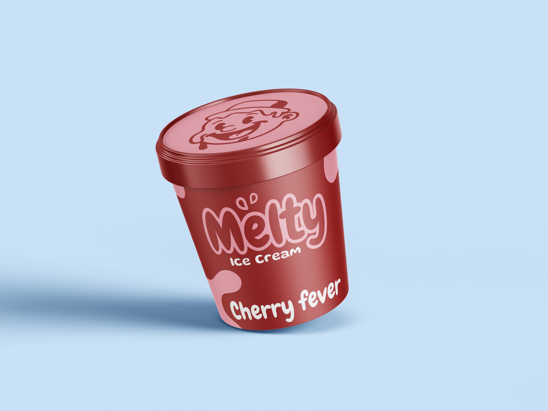
Mockups
Final Outcome
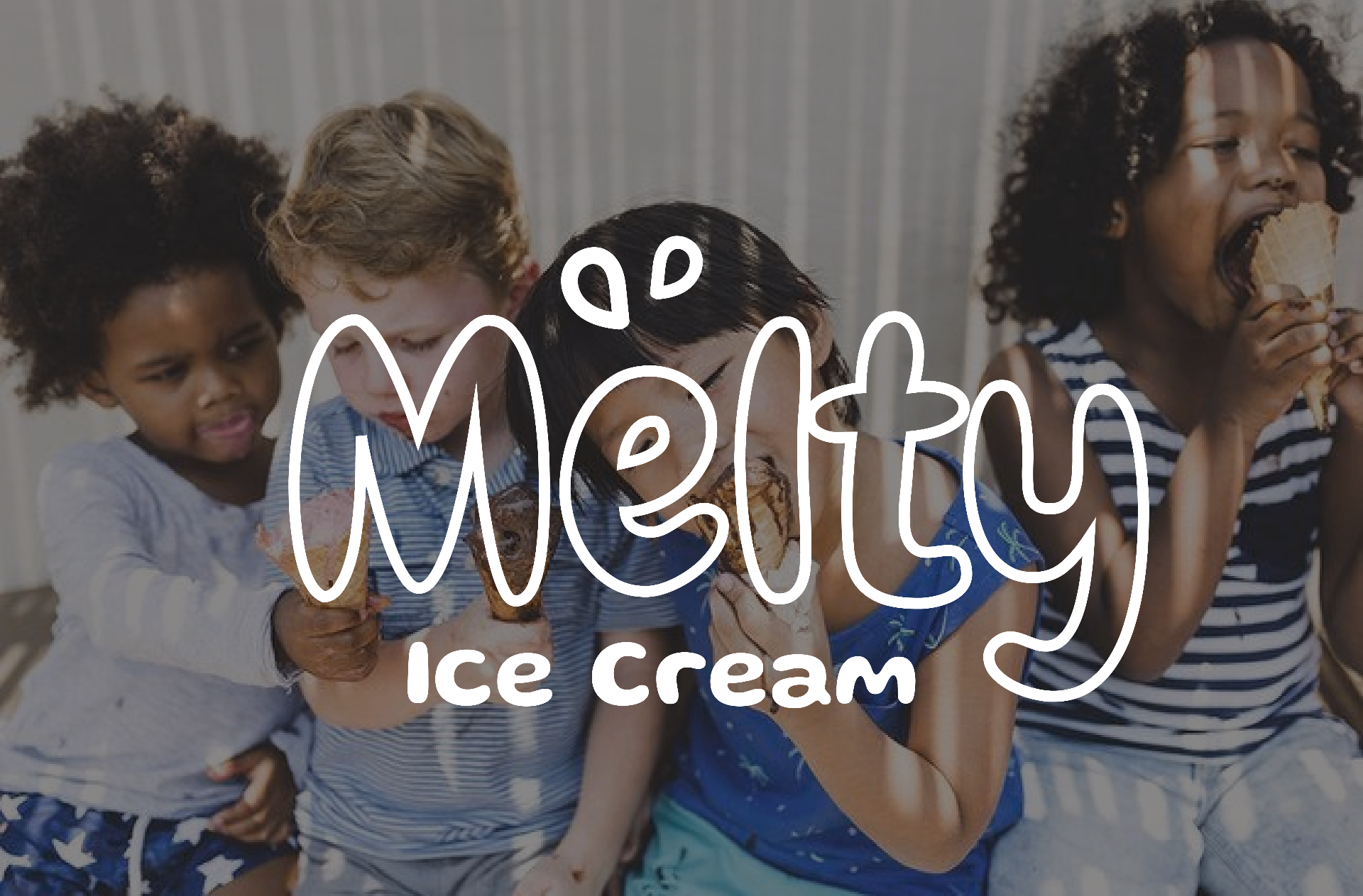
Melty's transforms the simple joy of ice cream into a vibrant brand experience filled with personality, nostalgia, and fun. Through a playful mascot, cheerful typography, and a bold color palette, the identity captures the excitement of summer while creating a memorable and recognizable presence across packaging, merchandise, and digital touchpoints.