
Lucio & Stelle
Lucio & Stelle is a baby wash gel packaging concept designed to bring a distinctive visual personality to everyday baby care.
The project explores how colour, illustration, typography and composition can work together to create packaging that feels considered, approachable and easy to recognise.
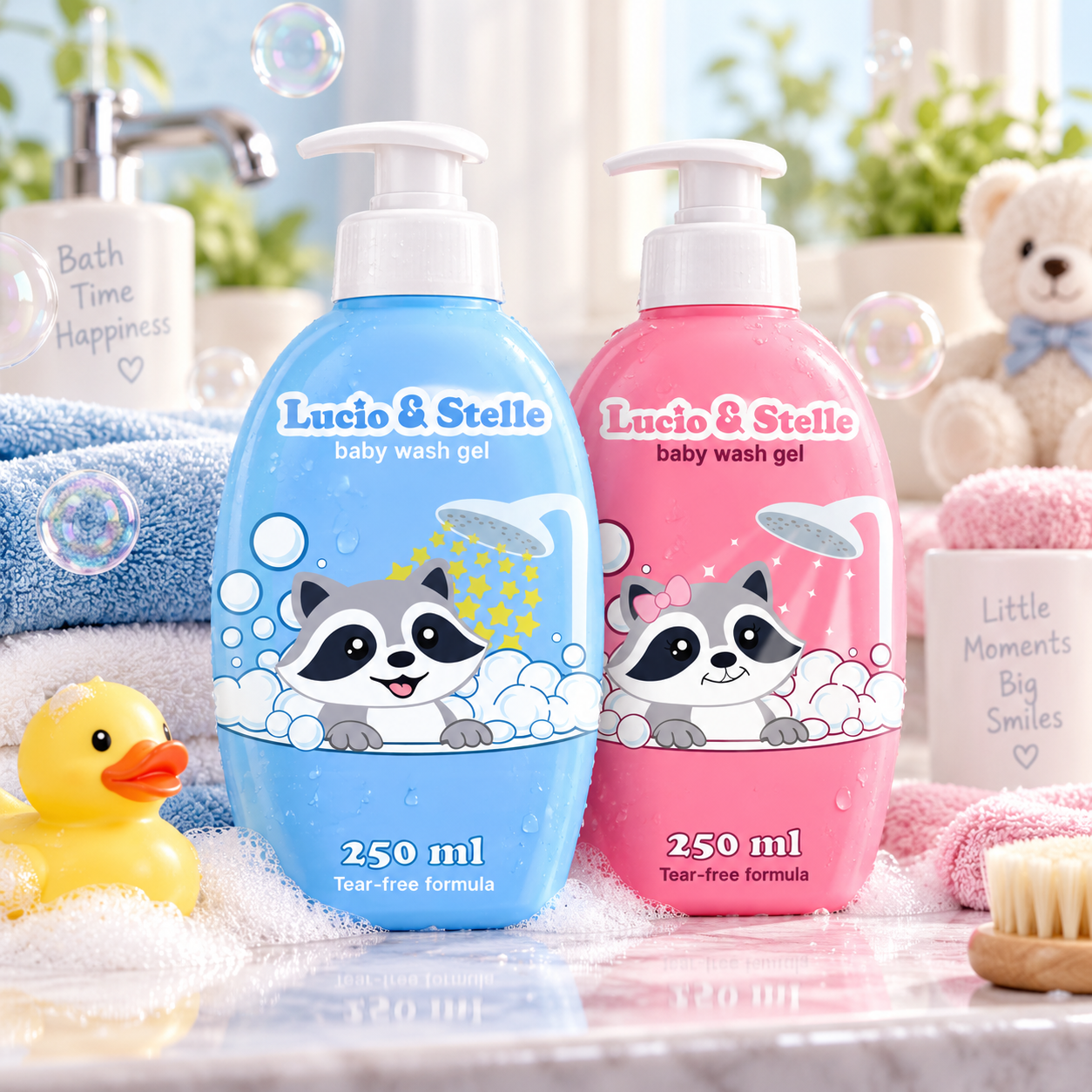
From the individual bottles to the pair seen together, every element contributes to one connected identity.
The project
Lucio & Stelle was developed as a packaging design concept for a baby wash gel product.
The goal was to give the product a clear personality through its packaging, while keeping the presentation simple and easy to read.
Baby care packaging needs a balance between character and clarity. It should feel friendly and welcoming, but the brand name and the essential product information still need to be found at a glance. The challenge was to create something distinctive without making the label feel busy.
The design concept
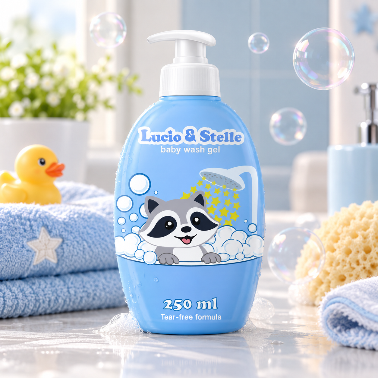
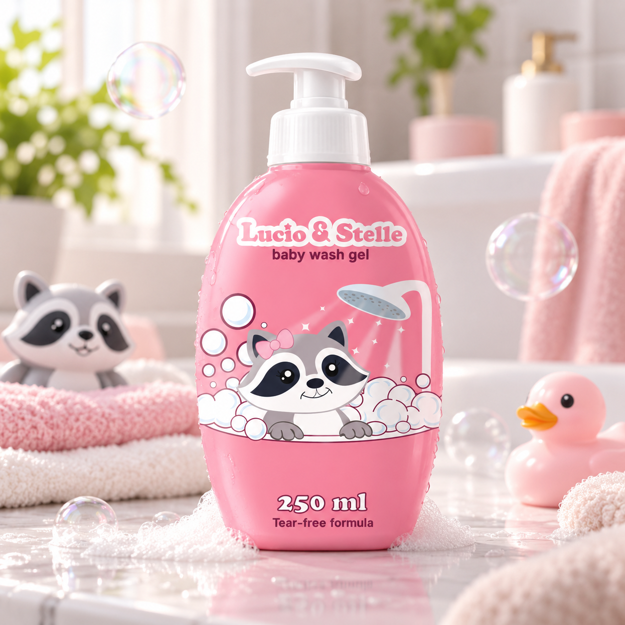
The packaging is built around a small raccoon character, peeking out from a tub full of foam with a shower head spraying above it. It turns the product into a little bath-time scene, so the label shows what the gel is for without needing to explain it.
The illustration style is soft and rounded: bold outlines, simple shapes and plenty of white bubbles that spill out from behind the character and frame the scene.
Above it, the Lucio & Stelle wordmark sits in a rounded, slightly playful serif with a light outline, with "baby wash gel" set small and clean underneath. The typography adds structure, while the illustration adds the personality.
The packaging system
Both bottles share one clear structure. The wordmark leads at the top, the product name sits just beneath it, the raccoon scene fills the centre, and the volume and "Tear-free formula" line close the label at the bottom.
This order keeps the label easy to read from top to bottom, with the brand first, the character in the middle and the practical information last. Every element has a role, so the playful details never compete with the information.
Colour & visual identity
Colour is what tells the two bottles apart. Each one is built on a single soft, light colour - sky blue or candy pink - that covers the whole bottle.
White ties them together: the pump, the bubbles and the wordmark carry it on both bottles, keeping the design light and clean against the coloured body.
Sky Blue
Candy Pink
White
The result
Seen side by side, the two bottles clearly belong to the same family. The same wordmark, raccoon, layout and bubble scene connect them, while colour and small details give each one its own look.
Lucio & Stelle brings colour, illustration, typography and label composition together into one connected packaging system - a baby wash gel concept with clear product presentation and a friendly, approachable personality.