
HOOK & BOX
Hook & Box is a brand identity concept for a modern seafood fast-food business.
The project explores how a distinctive visual language can bring personality to a food brand, creating a recognisable presence across its identity and everyday applications.
From the logo to the supporting brand elements, the goal was to build a visual system that feels connected, expressive and memorable.
The project
Hook & Box was developed as a visual identity for a seafood fast-food concept, bringing together the character of the brand and the practical needs of food-service communication.
Rather than treating the logo, colours and supporting graphics as separate pieces, the design brings them together into one shared visual direction, so Hook & Box stays recognisable wherever it appears.
The challenge
Food branding needs to communicate quickly.
In a fast-food setting, the identity has to be recognisable at a glance while staying clear and practical on boxes, trays, cups and signage.
The challenge was to give Hook & Box enough personality to stand apart, without losing the simplicity it needs to work at every size.
The big idea
The identity is built around one character from the sea: an octopus tentacle.
In the symbol, a single tentacle curls round on itself into a bold hook-like curve, with a row of round suckers running along its edge. It links straight back to the name - a hook shape for a seafood brand - and gives the identity a playful, slightly cheeky personality.
The same tentacle then reaches into the wordmark, which is what connects the whole system: one simple, recognisable shape that can lead on its own or sit alongside the name.


The logo
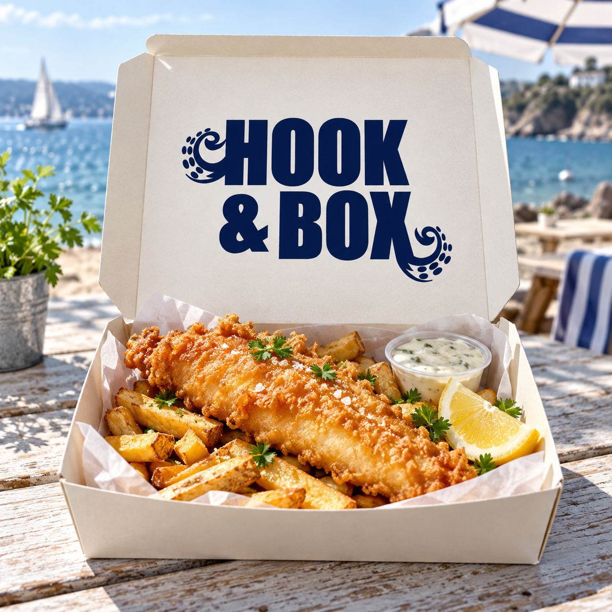
The wordmark stacks "HOOK" over "& BOX" in heavy, condensed capitals, set tight so the name reads as one compact block.
Two tentacles break out of that block: one curls from the left side of the H, the other from the foot of the X. They soften the strict letterforms and bring the character of the symbol into the name itself.
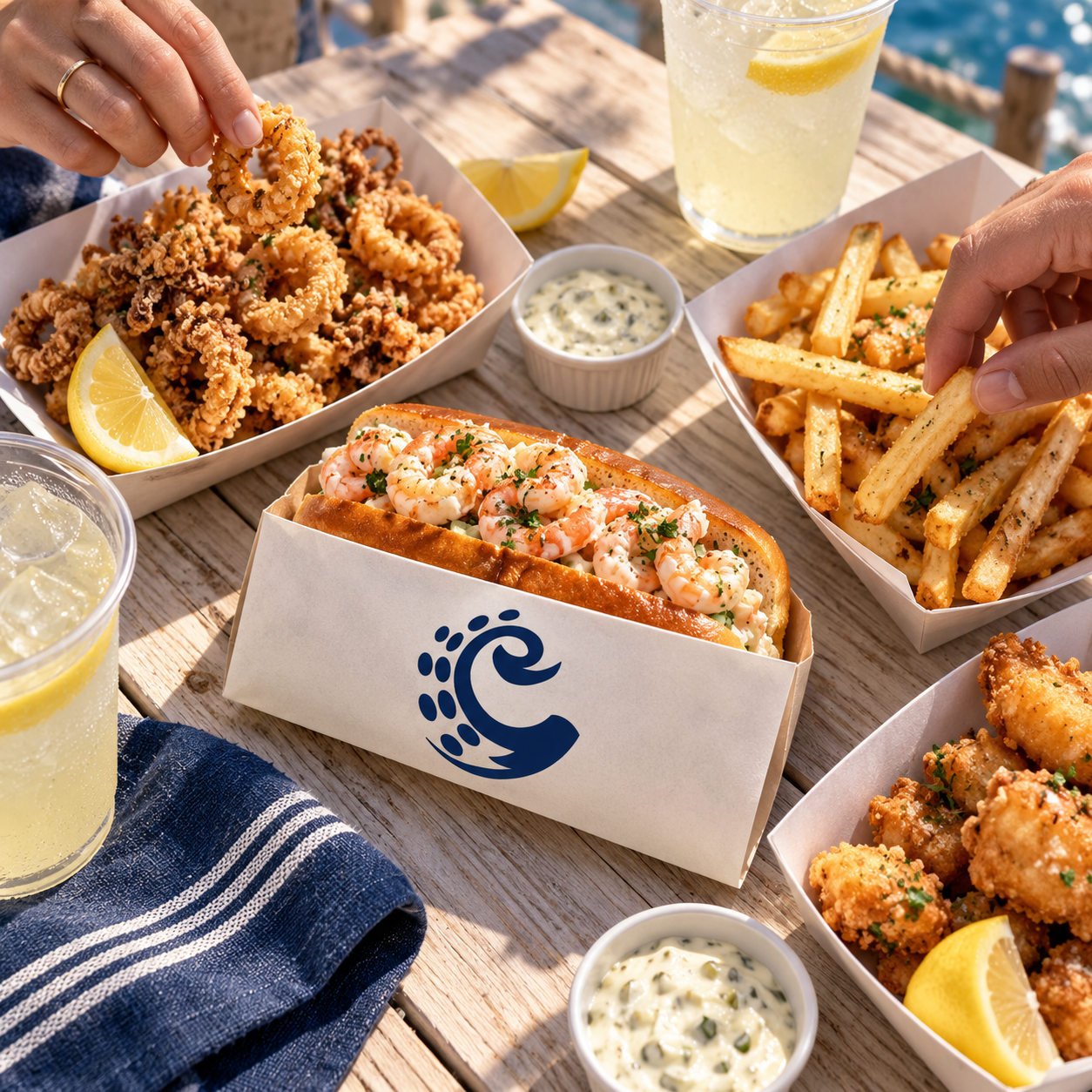
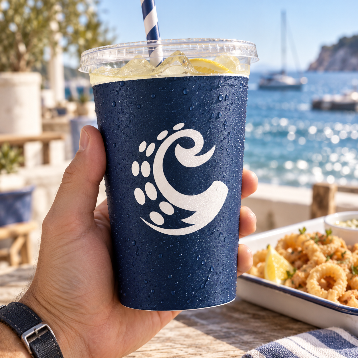
The symbol takes over where the full name would be too much, such as on a cup or the side of a tray. Both work in deep sea blue on white and reversed in white on blue, without changing their shape.


The visual language
The visual language is deliberately simple: two colours and one recognisable shape.
Deep Sea Blue carries the brand, from the logo to the cups, while White keeps the boxes and trays clean and fresh. Together they give Hook & Box a crisp, coastal feel that lets the food and the tentacle stand out.
Colour palette
Deep Sea Blue
#041368
White
#FFFFFF
The brand in practice
A strong food brand needs to work beyond its main logo.
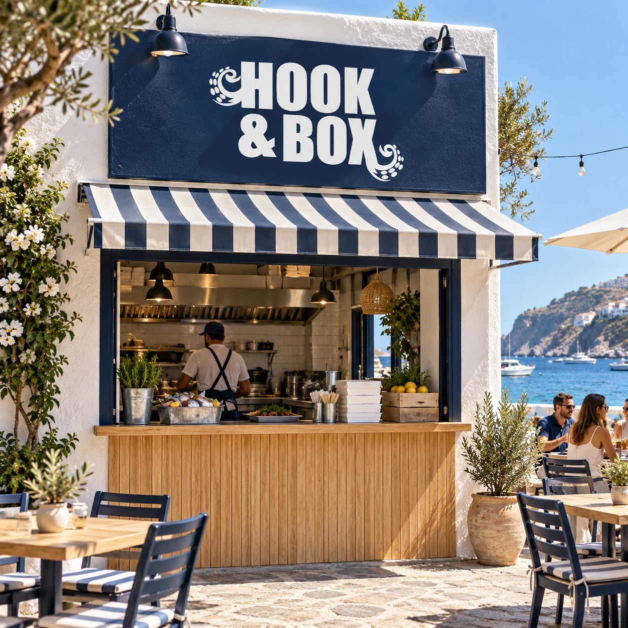
At Hook & Box, the wordmark leads on the restaurant signage and the takeaway boxes, while the tentacle symbol moves onto the smaller pieces - the trays and the cups.
The scale and format change, but the same shapes and colours connect every application, so the identity works as one visual system rather than a collection of separate designs.
The result
Hook & Box brings together a bold wordmark, a playful tentacle symbol and a simple two-colour palette into one connected brand system.
From the restaurant sign to a single cup, the result is a seafood identity that feels clear, memorable and full of character.