Hatch
A modern startup incubator identity built around growth, innovation, and collaboration. Hatch combines a bold geometric logo system with vibrant green accents to create an energetic, digital-first brand that supports early-stage founders.
Overview
Hatch is a modern startup incubator brand created to support early-stage entrepreneurs as they transform ideas into scalable businesses. The identity is built around growth, innovation, mentorship, and collaboration. Through a bold geometric logo system, vibrant green accents, and a clean digital-first aesthetic, Hatch communicates energy, progress, and opportunity. The visual identity is designed to feel approachable yet professional, helping founders connect with resources, guidance, and a thriving startup ecosystem.
Goal
Design a bold, modern incubator identity that signals momentum, collaboration, and opportunity while remaining flexible across digital platforms, events, mentorship programs, and founder communications.
Design Process
- 01
Researching modern startup incubators, accelerators, and venture studios to understand the visual language of innovation and entrepreneurship.
- 02
Developing a geometric letterform system inspired by building blocks, modular growth, and the structured nature of scaling a business.
- 03
Crafting a vibrant green palette paired with deep navy to balance energy and trust across digital-first applications.
- 04
Applying the identity across web, presentations, founder kits, and event collateral to ensure consistency throughout the incubator experience.
Logo / Identity
The Hatch logo is built from modular geometric shapes that interlock to form a confident H mark. The system is designed to feel structural and progressive — a visual metaphor for assembling ideas, teams, and businesses from the ground up.
Color Palette
Hatch Green
#2ED88E
Deep Navy
#071E3A
White
#FFFFFF
Typography
Primary Brand Typeface
Unbounded Medium
Used for the Hatch logo, headlines, key messaging, and brand-defining moments. Its geometric construction and modern character communicate innovation, confidence, and forward-thinking growth while reinforcing the structured nature of the Hatch identity.
ABCDEFGHIJKLMNOPQRSTUVWXYZ
abcdefghijklmnopqrstuvwxyz
0123456789
Secondary Typeface
Montserrat Medium
Used for body copy, presentations, digital interfaces, startup dashboards, founder communications, and supporting content. Montserrat provides excellent readability and a clean contemporary feel while complementing the strong personality of Unbounded.
ABCDEFGHIJKLMNOPQRSTUVWXYZ
abcdefghijklmnopqrstuvwxyz
0123456789
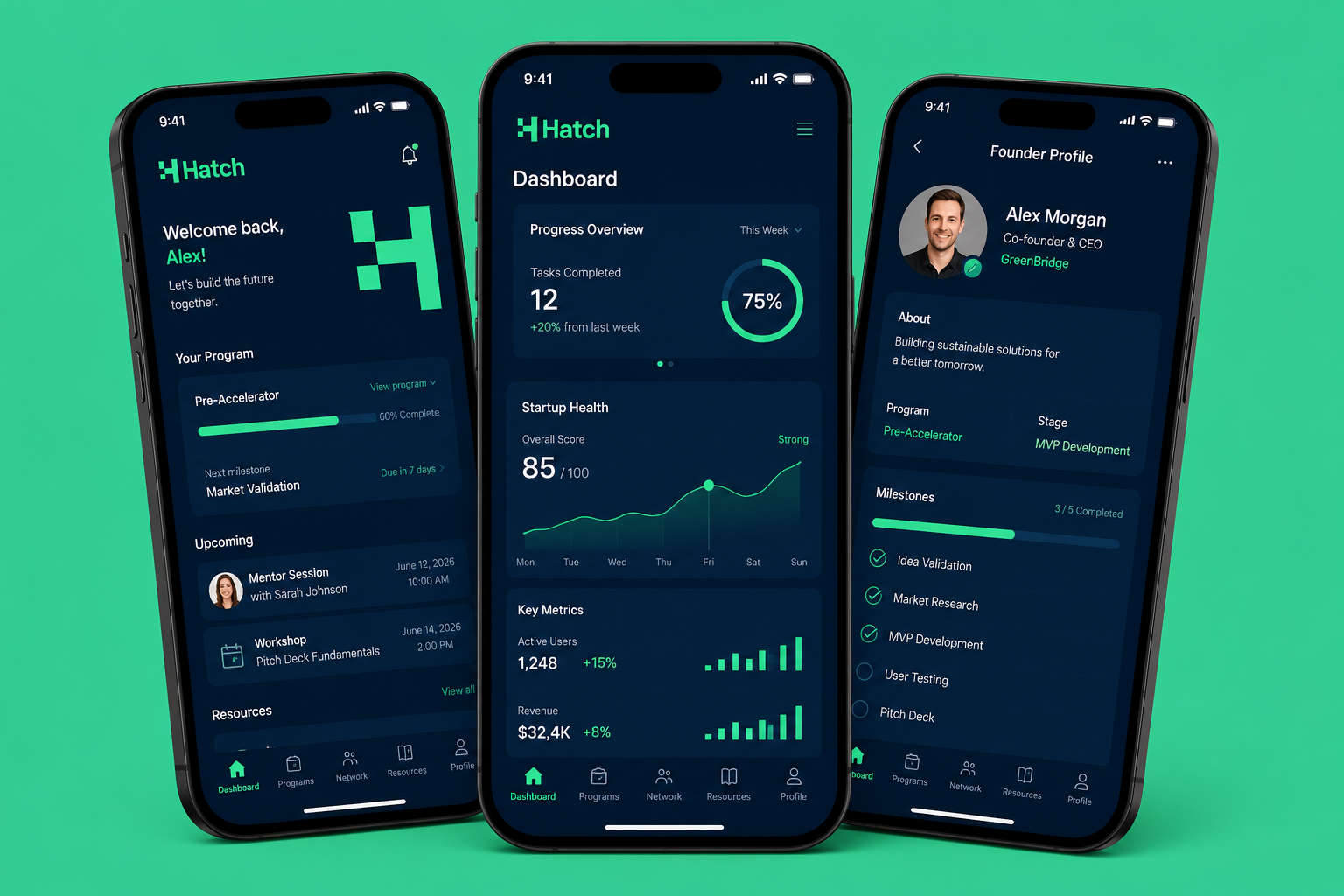
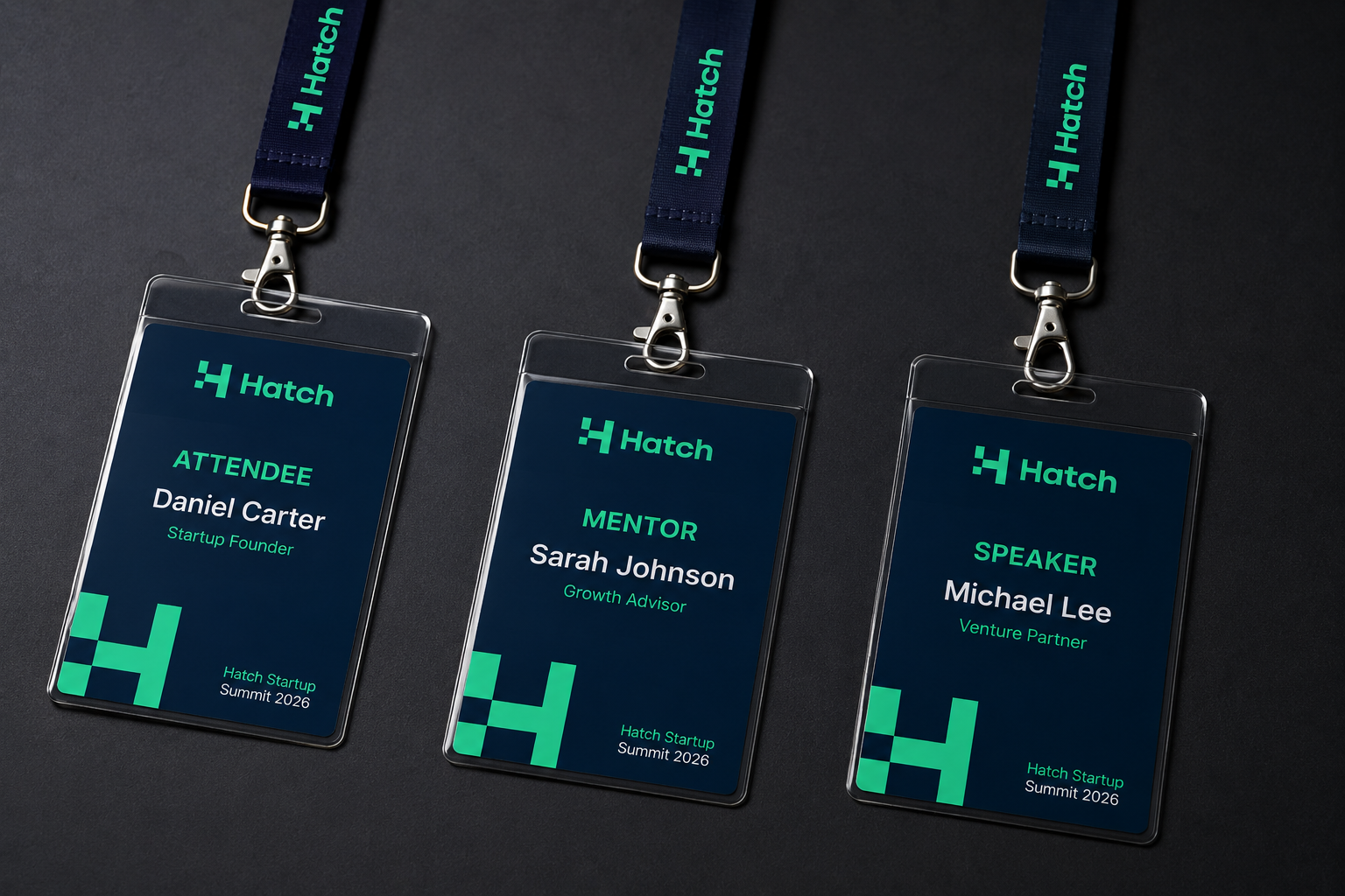
Mockups
Final Outcome
Hatch delivers a confident, digital-first identity that captures the energy of early-stage entrepreneurship. Through a modular geometric logo, a vibrant green and navy palette, and a clean type system, the brand creates a memorable presence across digital platforms, events, and founder touchpoints while signaling growth, opportunity, and momentum.