Milo's Flowers
A warm and welcoming floral brand identity that blends nostalgia with modern charm, created for a local flower shop focused on meaningful moments, handcrafted bouquets, and a friendly community feel.
Overview
Milo's Flowers is a warm and welcoming floral brand created for a local flower shop that combines nostalgic charm with a fresh modern aesthetic. The identity focuses on creating an emotional connection through soft colors, friendly typography, and approachable visual elements that make every bouquet feel personal and memorable.
Goal
Create a floral brand identity that feels both nostalgic and contemporary, helping a small local flower shop stand out through warmth, friendliness, and memorable visual storytelling while remaining versatile across packaging, signage, social media, and printed materials.
Design Process
- 01
Researching local flower shops, vintage floral aesthetics, and modern boutique branding to establish the desired emotional direction.
- 02
Developing a friendly wordmark and visual identity system that balances softness, personality, and readability.
- 03
Building a cohesive color palette and typography system inspired by flowers, nature, and nostalgic design elements.
- 04
Applying the identity across packaging, stationery, social media, and branded touchpoints to ensure consistency and recognition.
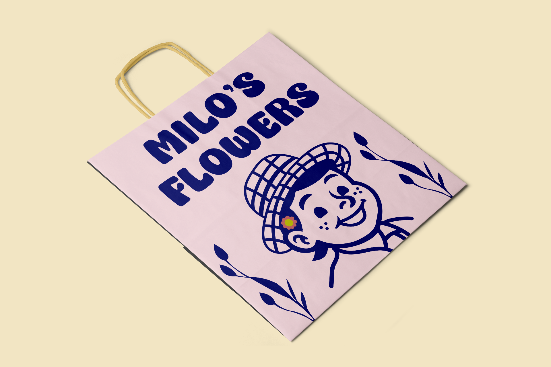
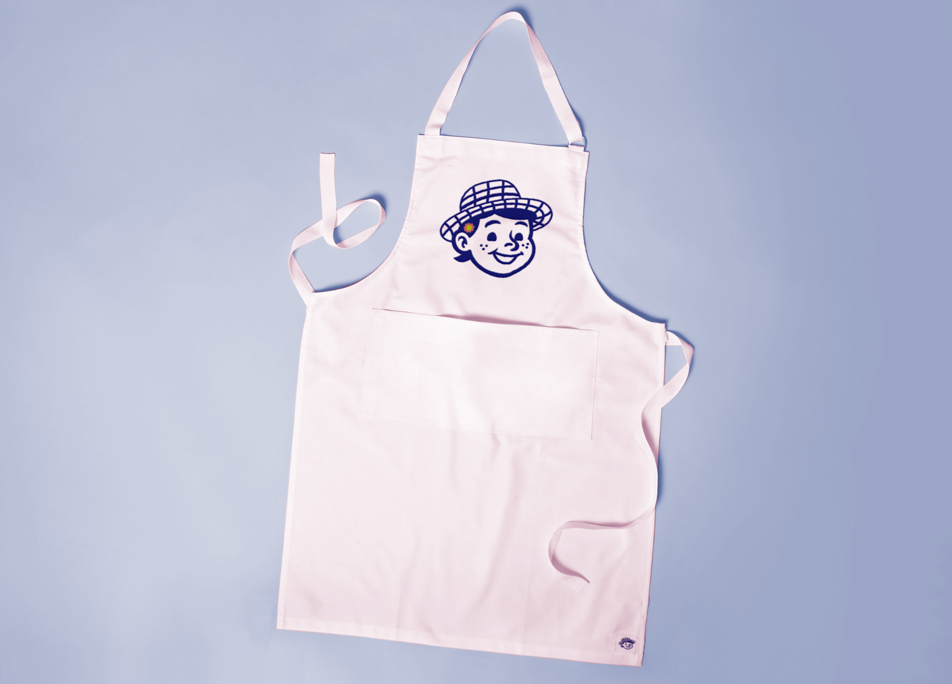
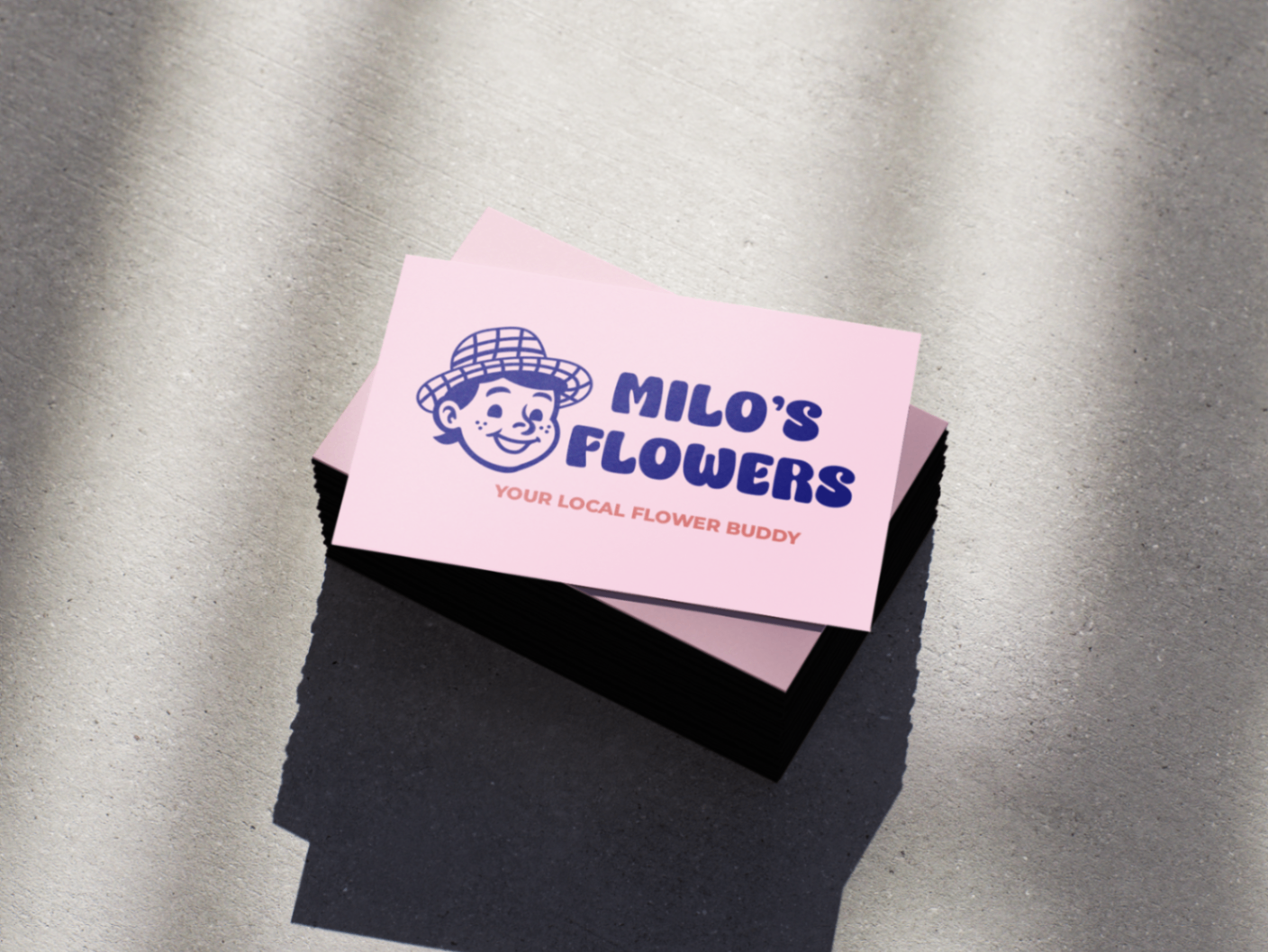
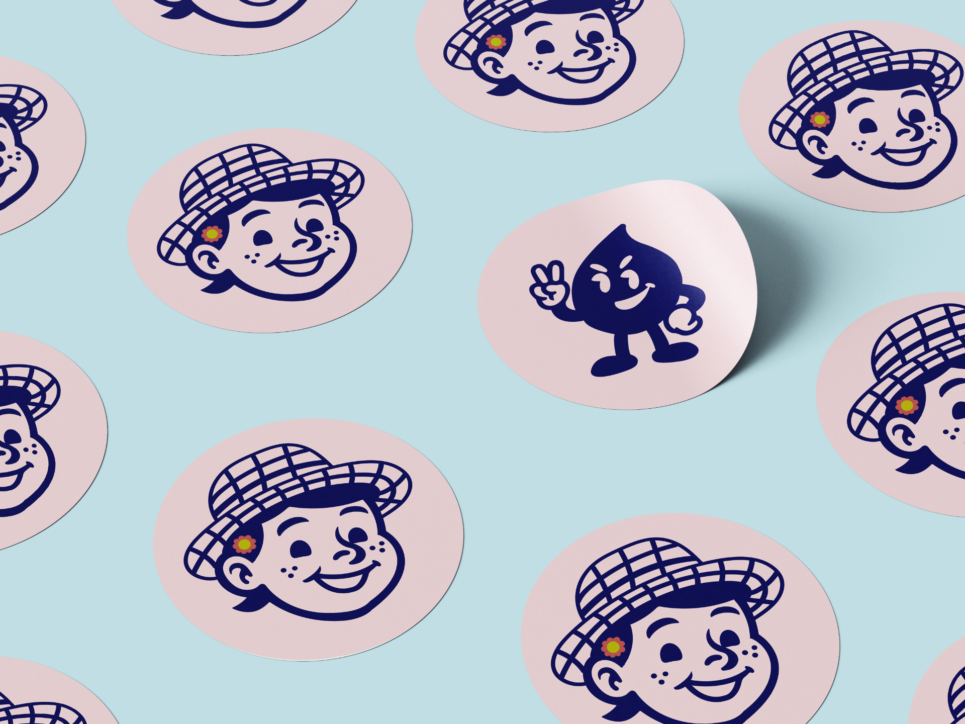
Logo / Identity
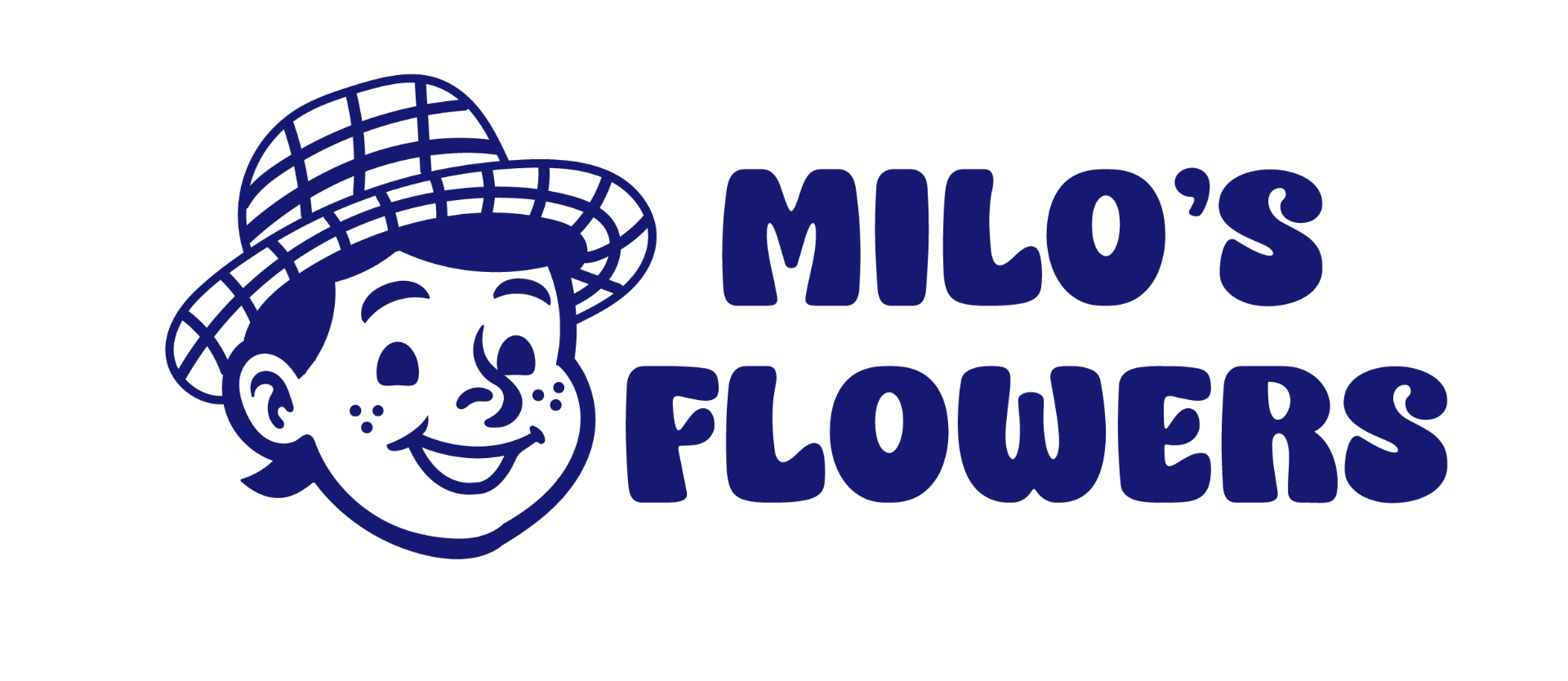


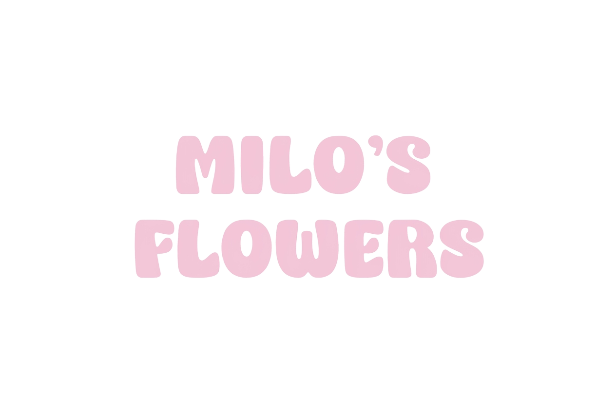
A playful visual identity system built around a friendly flower-shop mascot, nostalgic typography, and warm pastel colors. The logo family balances charm, familiarity, and modern simplicity while remaining flexible across packaging, signage, and branded materials.
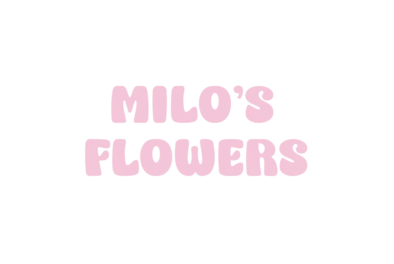
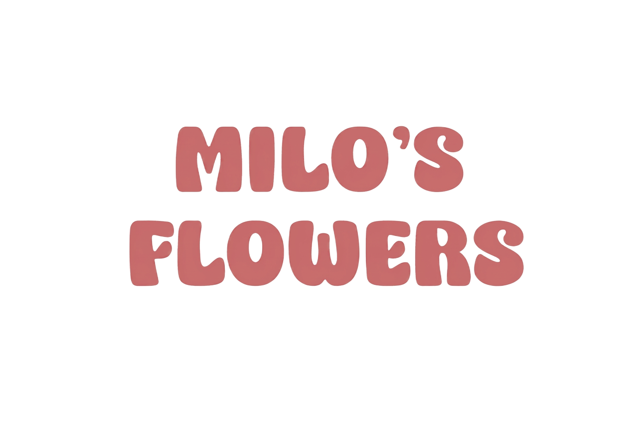
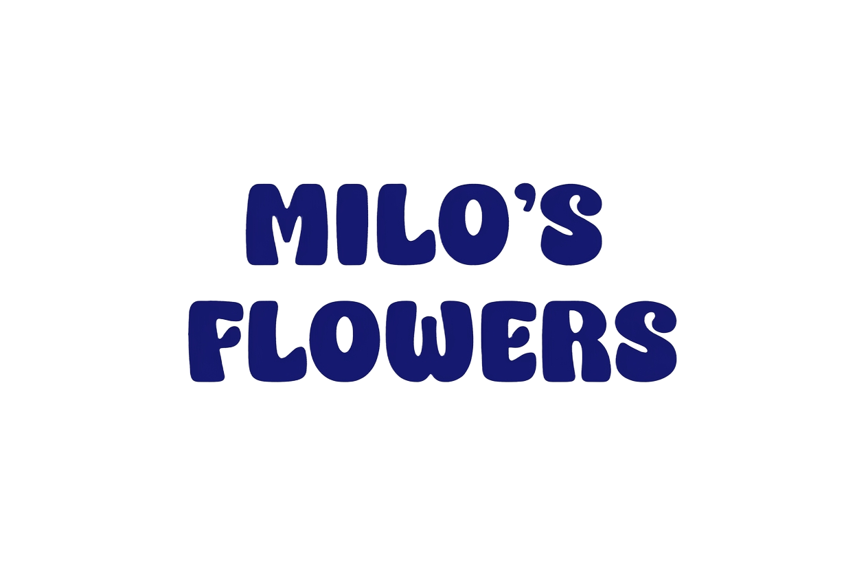
Color Palette
Deep Blue
#151972
Soft Pink
#F3C7D9
Warm Rose
#C96C6C
Typography
Display & wordmark
Super Chunky
Super Chunky brings warmth, friendliness, and nostalgia to the brand. Its playful rounded forms create a memorable personality that feels welcoming, cheerful, and approachable.
ABCDEFGHIJKLMNOPQRSTUVWXYZ
abcdefghijklmnopqrstuvwxyz
0123456789
Body & UI
Montserrat SemiBold
Montserrat SemiBold provides clarity and modern structure, balancing the playful personality of the brand with strong readability across print and digital touchpoints.
ABCDEFGHIJKLMNOPQRSTUVWXYZ
abcdefghijklmnopqrstuvwxyz
0123456789
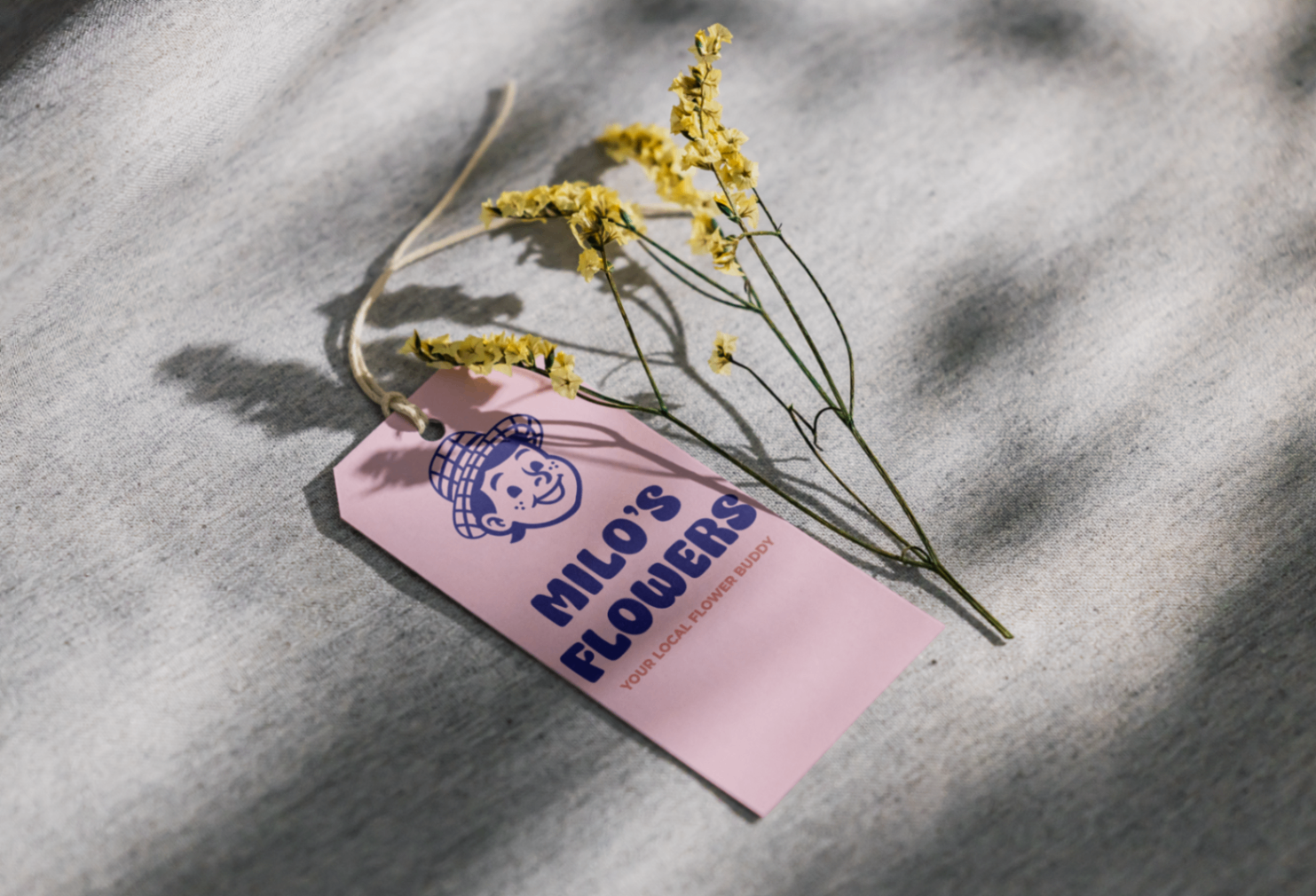
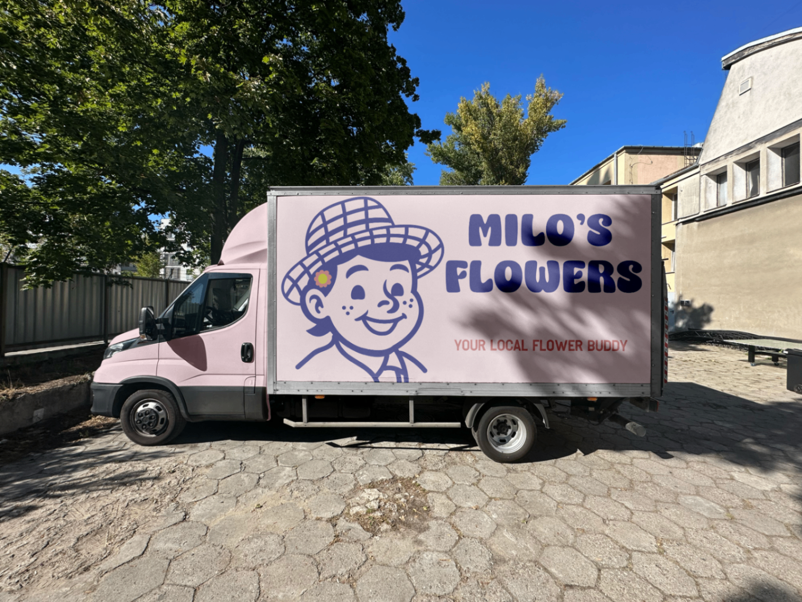
Mockups
Final Outcome
An identity that feels built, not drawn.