
FizzQ
FizzQ is a soda packaging concept built for people who like their drinks with a little more personality.
Bright colours, playful fruit illustrations and plenty of bubbles come together to create an identity that refuses to blend into the background.
Three flavours. Three different personalities. One unmistakably fizzy visual world.
The project
FizzQ was developed as a playful beverage identity with packaging at the centre of the experience.
The aim was to build something immediately recognisable - not through complicated messaging, but through strong visual character.
From the illustrated fruit to the bubbles and graphic bursts, every part of the can was designed to feel energetic, approachable and full of movement.
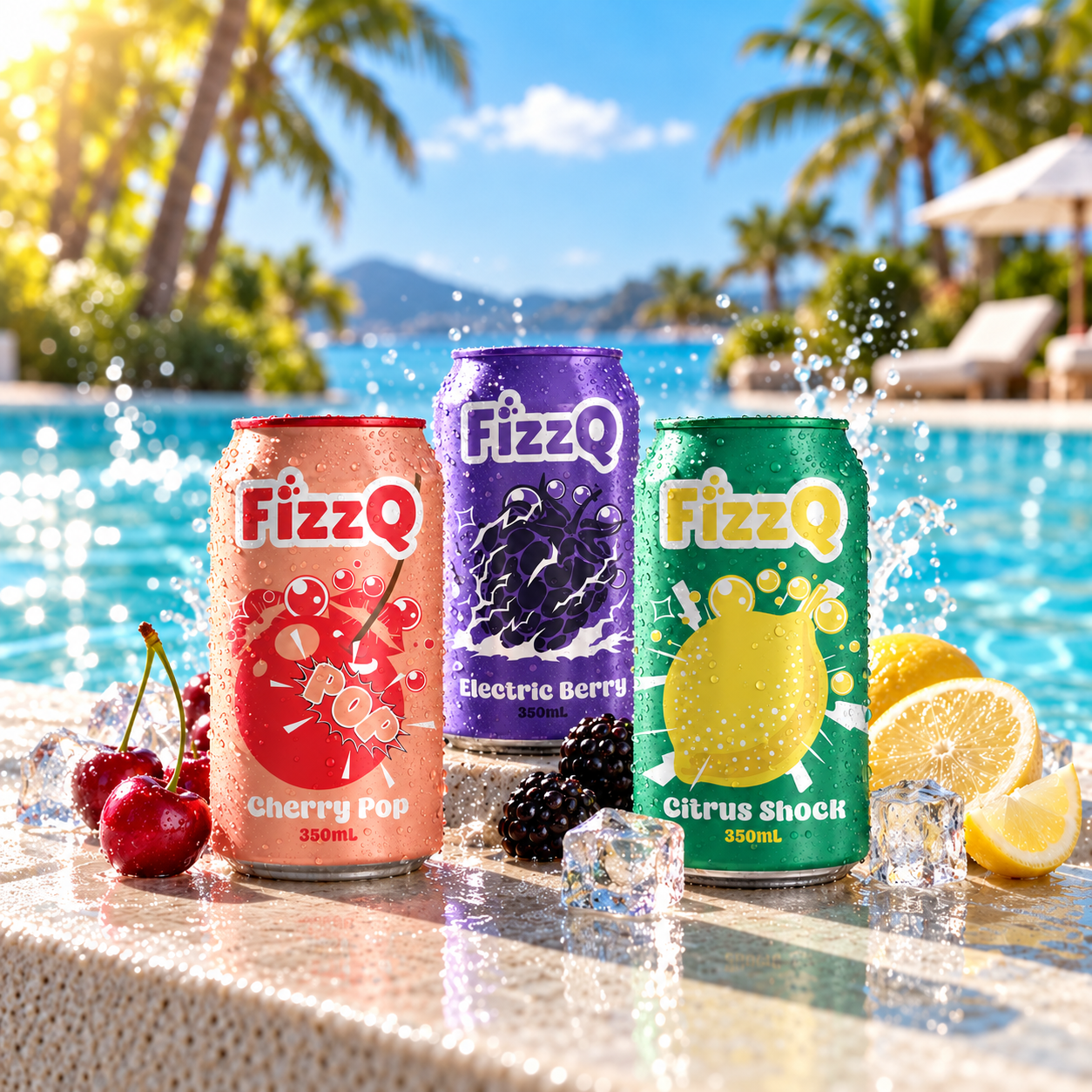
Rather than treating each can as an individual design, the visual system brings all three flavours together through shared illustration principles and a consistent packaging composition.
The packaging system
Soft drink packaging competes for attention in a crowded visual environment. Colour alone isn't enough - the can also needs a recognisable personality.
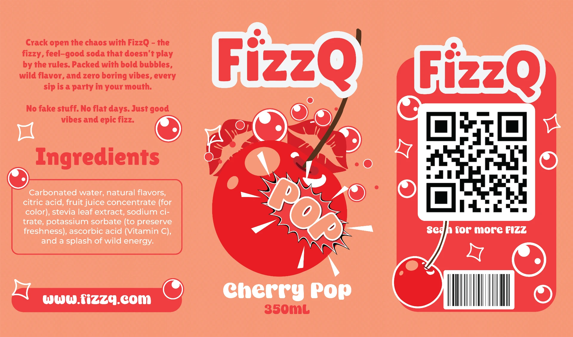
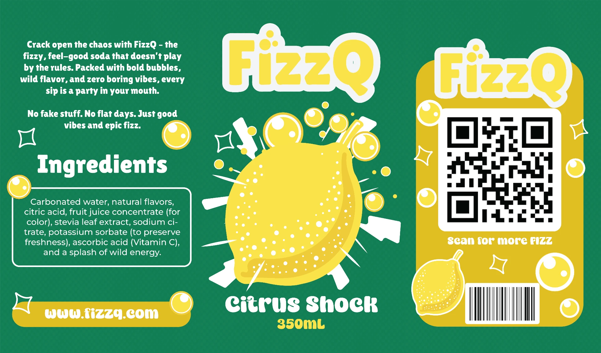
The packaging system gives every flavour its own colour world, illustration and attitude, while a shared structure keeps the range connected: the wordmark on the front, the flavour name and fruit illustration at the centre, and the ingredients, QR code and barcode panel carried consistently across the back and side.
The illustrations do most of the talking. Fruit becomes the main character, while bubbles, graphic bursts and exaggerated scale create a sense of movement and carbonation.
The goal was to make every flavour immediately identifiable, even when all three sit side by side.
Crack open the chaos.
Cherry Pop
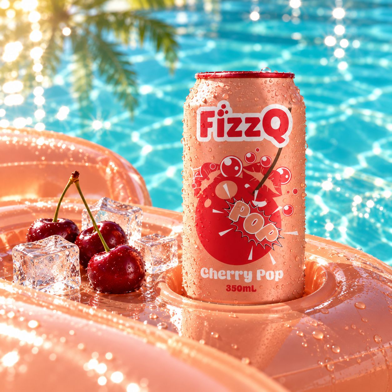
Cherry Pop brings a playful burst of energy to the FizzQ range.
Its warm coral background and vibrant red details create a bold, cheerful colour combination.
At the centre of the packaging, the cherry illustration becomes an expressive graphic element, supported by bubbles and an oversized comic-style POP treatment.
The design uses exaggerated scale and playful shapes to capture the flavour's character while remaining unmistakably part of the FizzQ family.
Electric Berry
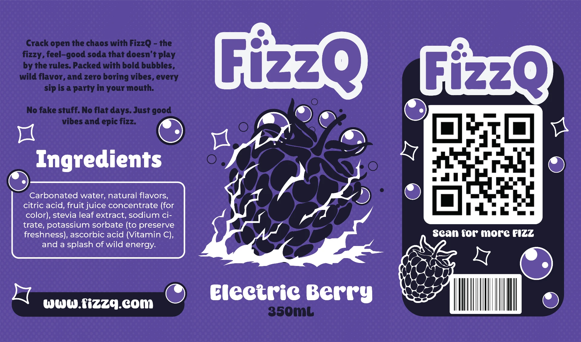
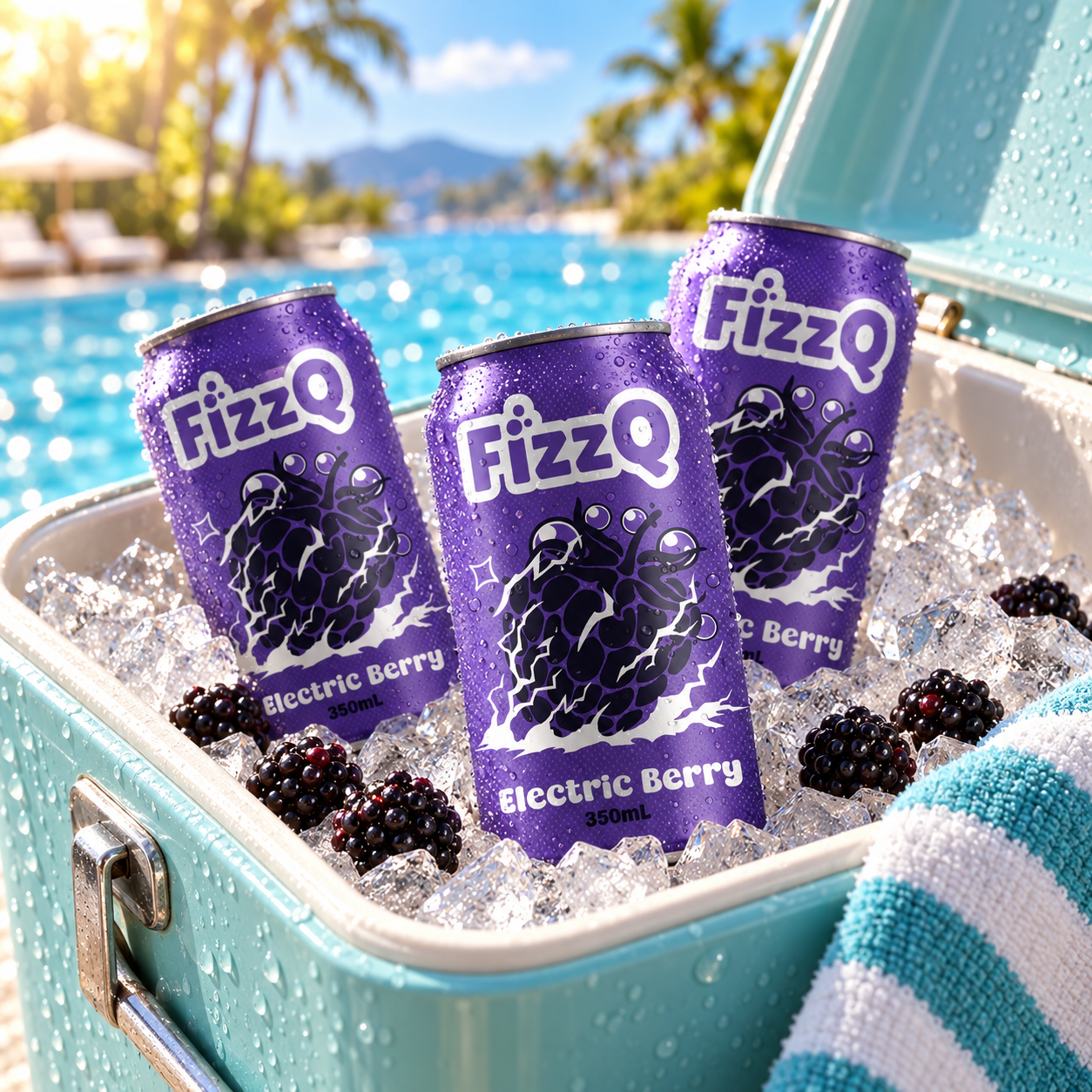
Electric Berry introduces a different kind of energy to the FizzQ identity.
The rich purple palette creates a strong visual contrast with the other flavours, while the illustrated berry and electric-style accents give the packaging its own personality.
Sharp energetic details interact with the softer fruit and bubble shapes, creating a playful tension between sweetness and intensity.
Despite its different colour palette, the design retains the same wordmark, layout principles and expressive illustration style as the rest of the range.
Citrus Shock
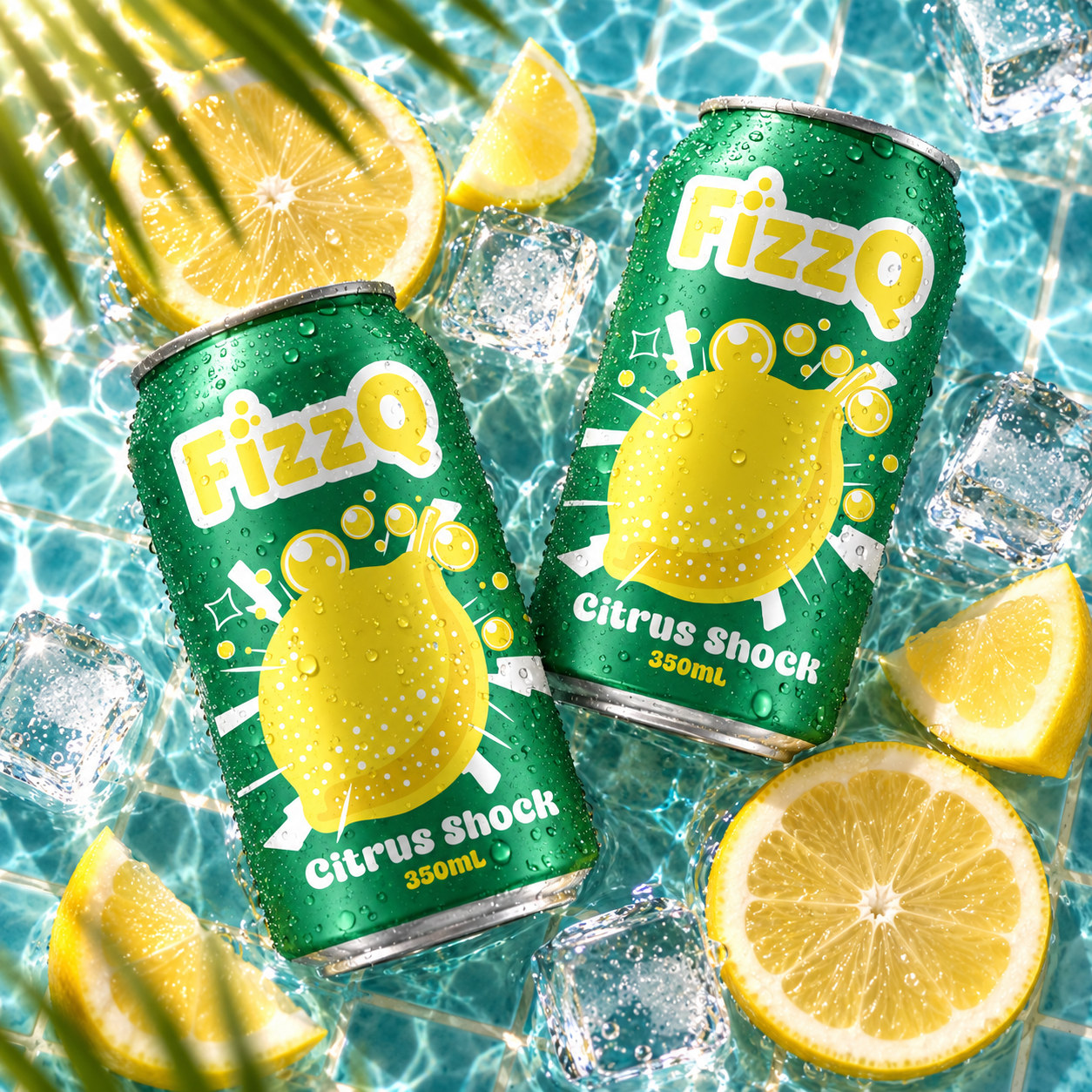
Citrus Shock uses a vibrant green and yellow colour combination to communicate a fresh, energetic personality.
A large illustrated lemon dominates the composition, surrounded by bubbles, bursts and energetic graphic details.
The strong contrast between the citrus illustration and the darker green background creates an instantly recognisable appearance.
Like Cherry Pop and Electric Berry, the design uses the same visual system while giving the flavour a distinctive identity of its own.
One brand, three personalities
The strength of the FizzQ packaging system comes from the balance between consistency and variety.
Cherry Pop, Electric Berry and Citrus Shock each have their own visual personality, but share the same fundamental brand elements.
The bold illustration style, prominent flavour naming, recurring bubble graphics and a shared front, back and side layout connect the three designs into one recognisable range.
Different flavours, different colours - the same unmistakable FizzQ energy.
The result
FizzQ brings three distinctive flavour identities together through one expressive packaging system.
Playful illustrations, contrasting colours and a consistent packaging structure create a range that feels lively on every can.
Each flavour has its own character, but together they form a connected, recognisable brand world.
A packaging concept designed to make every can feel like a little burst of personality.