
Colors On
Colors On is a concept packaging design created for the Bulgarian confectionery brand Sweet+.
Inspired by vibrant flavours and playful snacking moments, the packaging uses bold colour, modern graphics and strong shelf presence to create a memorable, energetic experience for a younger audience.
The project
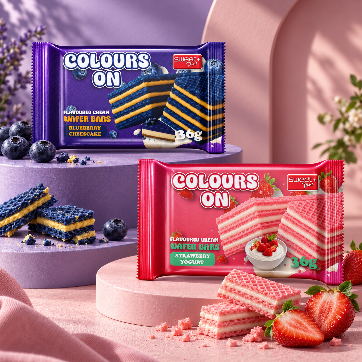
Colors On is a range of flavoured cream wafer bars, developed as a packaging concept for Sweet+. The range includes two flavours: Blueberry Cheesecake and Strawberry Yogurt.
The aim was to design a flow pack that feels fun and full of flavour, while staying clearly connected to the Sweet+ brand through its logo on every pack.
The challenge
Wafer bars sit on crowded shelves, often next to dozens of similar products. A small pack has only a moment to catch someone's eye.
The challenge was to give a simple everyday snack a bold personality - packaging that stands out from a distance, tells you the flavour at a glance and still feels like one recognisable product line.
The big idea
The idea is in the name: let colour lead.
Each flavour is given one strong, saturated colour that covers the whole pack. The wafer itself becomes part of the colour story - blue wafer layers for blueberry, pink wafer layers for strawberry - so the product inside matches the pack outside.
A chunky, rounded "Colours On" wordmark with a white fill and dark outline sits on top, giving the range a playful, friendly voice.
The packaging system
Both packs follow one clear structure. The wordmark leads in the top left, the Sweet+ logo sits in the top right, and a large close-up of the stacked wafer bars fills the centre and right side. Below the wordmark, "Flavoured cream wafer bars" and the flavour name are set in a small label, with the 36g weight next to the wafer.
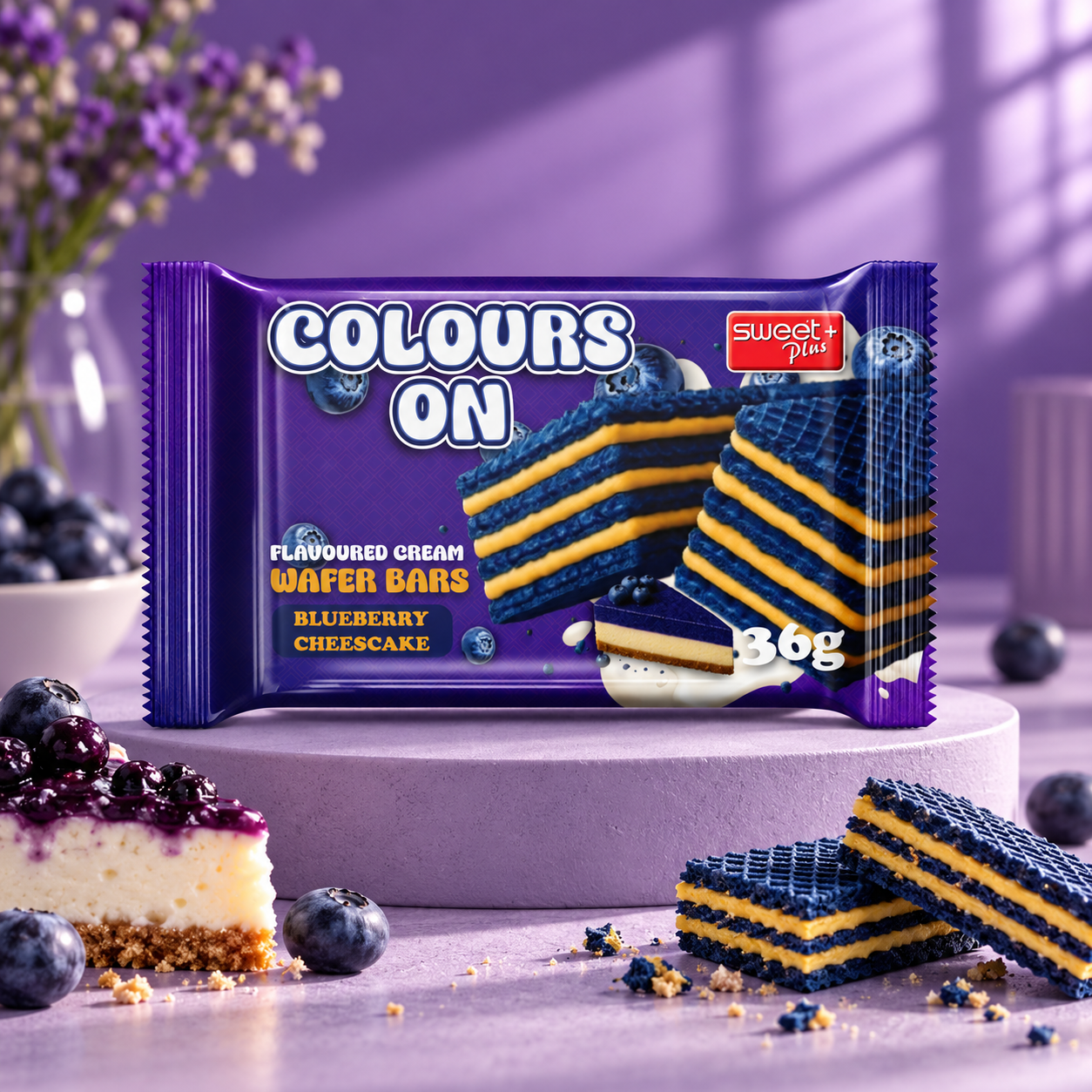
Blueberry Cheesecake. A deep violet pack with blue wafer layers and a golden cream filling. Blueberries and a slice of cheesecake sit around the wafers, with a splash of cream flowing underneath.
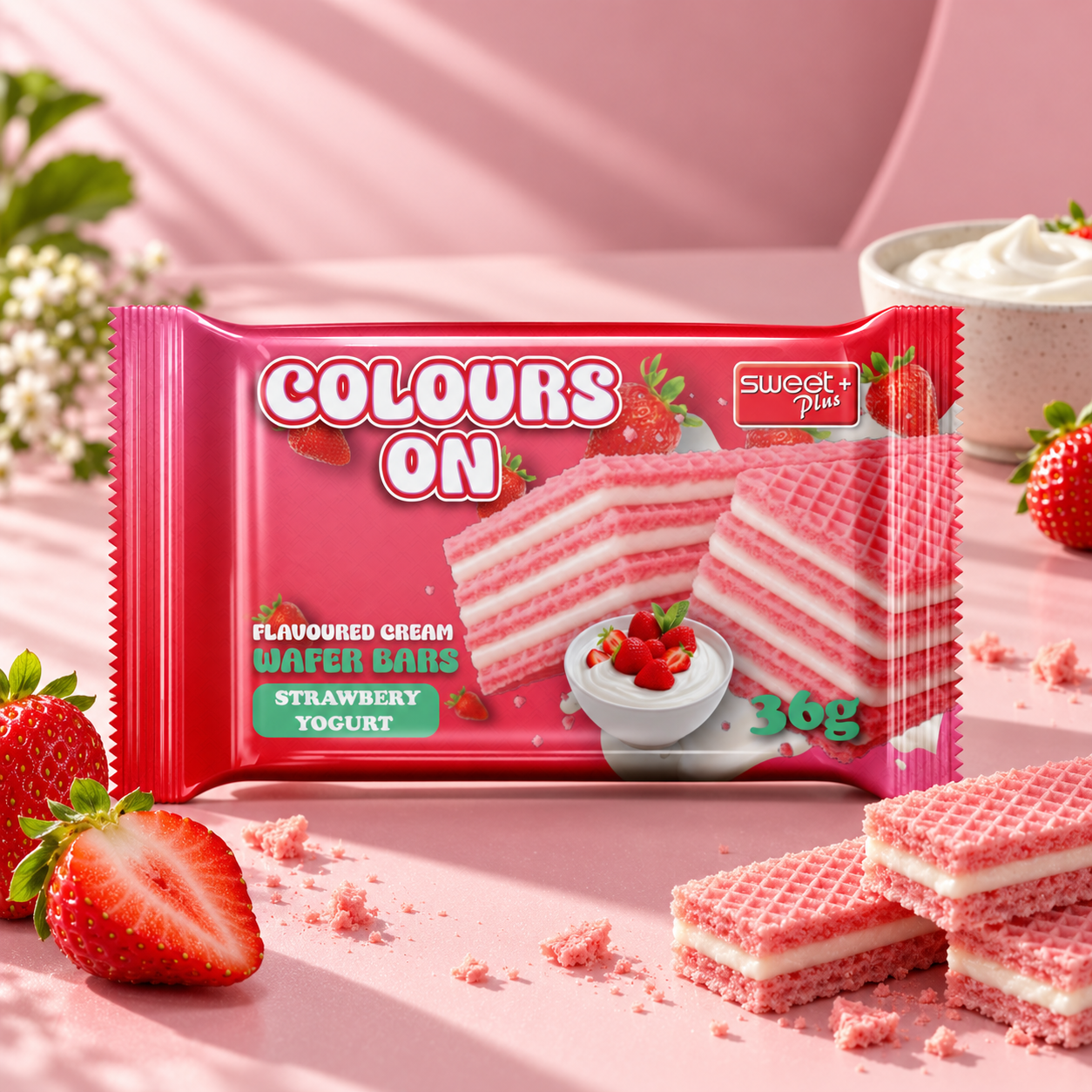
Strawberry Yogurt. A bright raspberry-red pack with pink wafer layers and a white cream filling. Fresh strawberries and a bowl of yogurt with strawberries complete the scene, and the flavour label switches to a fresh mint green.
Colour & visual language
Colour does most of the work. Violet and blue signal blueberry, while red and pink signal strawberry, so each flavour can be found instantly on the shelf.
White ties the range together. It carries the wordmark, the cream splashes and the details on both packs, keeping them light and clean against the strong background colours. Floating fruit, crumbs and cream add movement and make every pack feel fresh and appetising.
The result
Seen side by side, the two packs clearly belong to the same family. The same wordmark, layout and wafer close-up connect them, while colour gives each flavour its own personality.
Colors On brings bold colour, playful graphics and a consistent packaging structure together into one connected range - a wafer bar concept for Sweet+ designed to be noticed and remembered.