Grip Hub
Grip Hub is a modern climbing center designed for climbers of all levels, from complete beginners to advanced athletes. The brand focuses on creating a supportive environment where people can challenge themselves, improve their skills, and connect with the community.
Overview
Grip Hub is a modern climbing center designed for climbers of all levels, from complete beginners to advanced athletes. The brand focuses on creating a supportive environment where people can challenge themselves, improve their skills, and connect with the community.
Goal
Create a bold and energetic brand identity that reflects the excitement of climbing while remaining approachable for beginners and inspiring for experienced athletes. The identity should communicate movement, progression, community, and confidence across physical spaces, merchandise, signage, and digital platforms.
Design Process
- 01
Researching modern climbing culture, indoor climbing gyms, and outdoor adventure brands to understand the visual language of the climbing community.
- 02
Exploring geometric forms, routes, and climbing-wall structures to develop a distinctive logo system that symbolizes movement, challenge, and upward progression.
- 03
Building a bold visual identity using high-contrast colors, strong typography, and dynamic graphic elements that reinforce energy and performance.
- 04
Applying the identity across signage, merchandise, apparel, social media, and environmental graphics to ensure consistency and scalability throughout the entire brand experience.
Logo / Identity
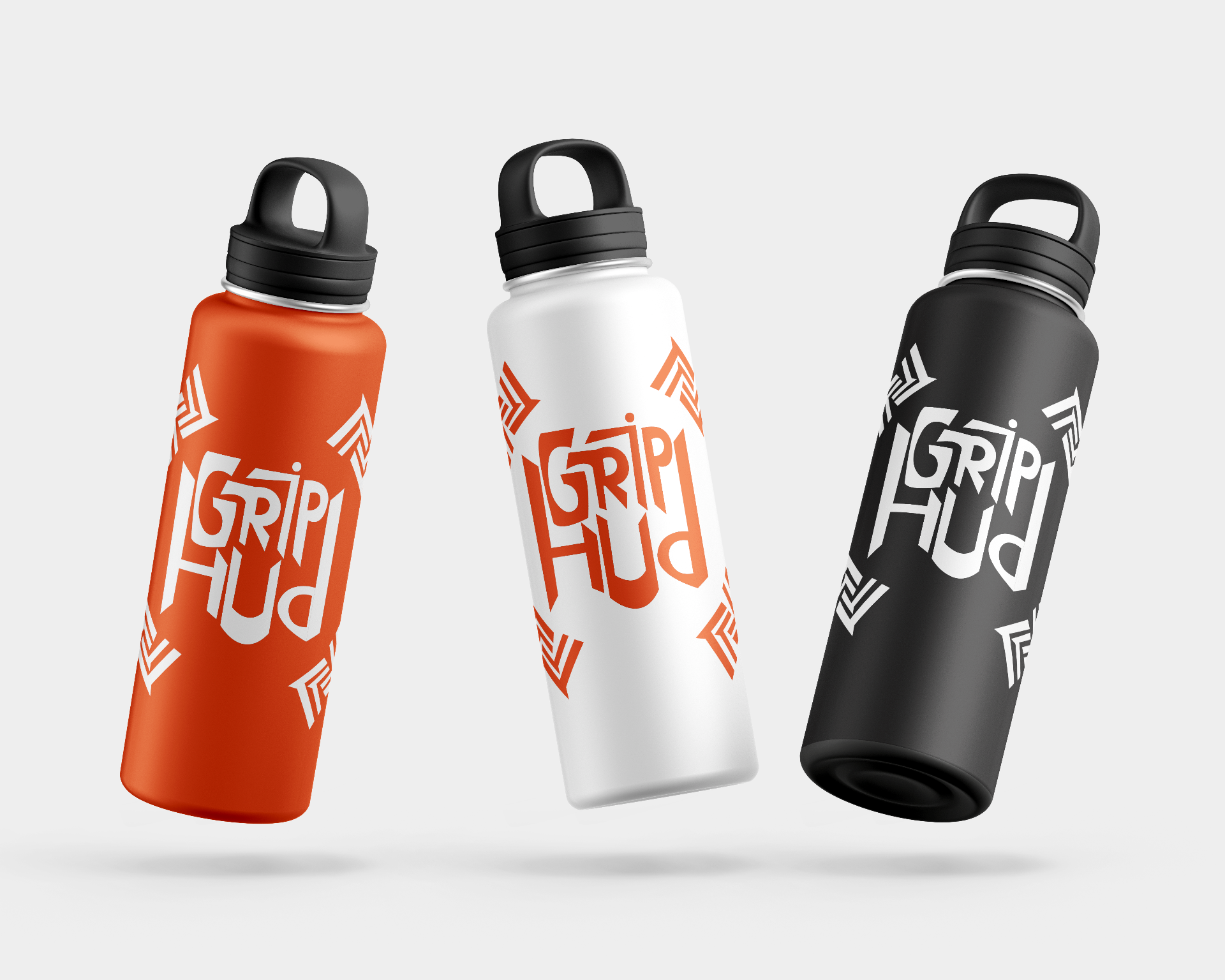
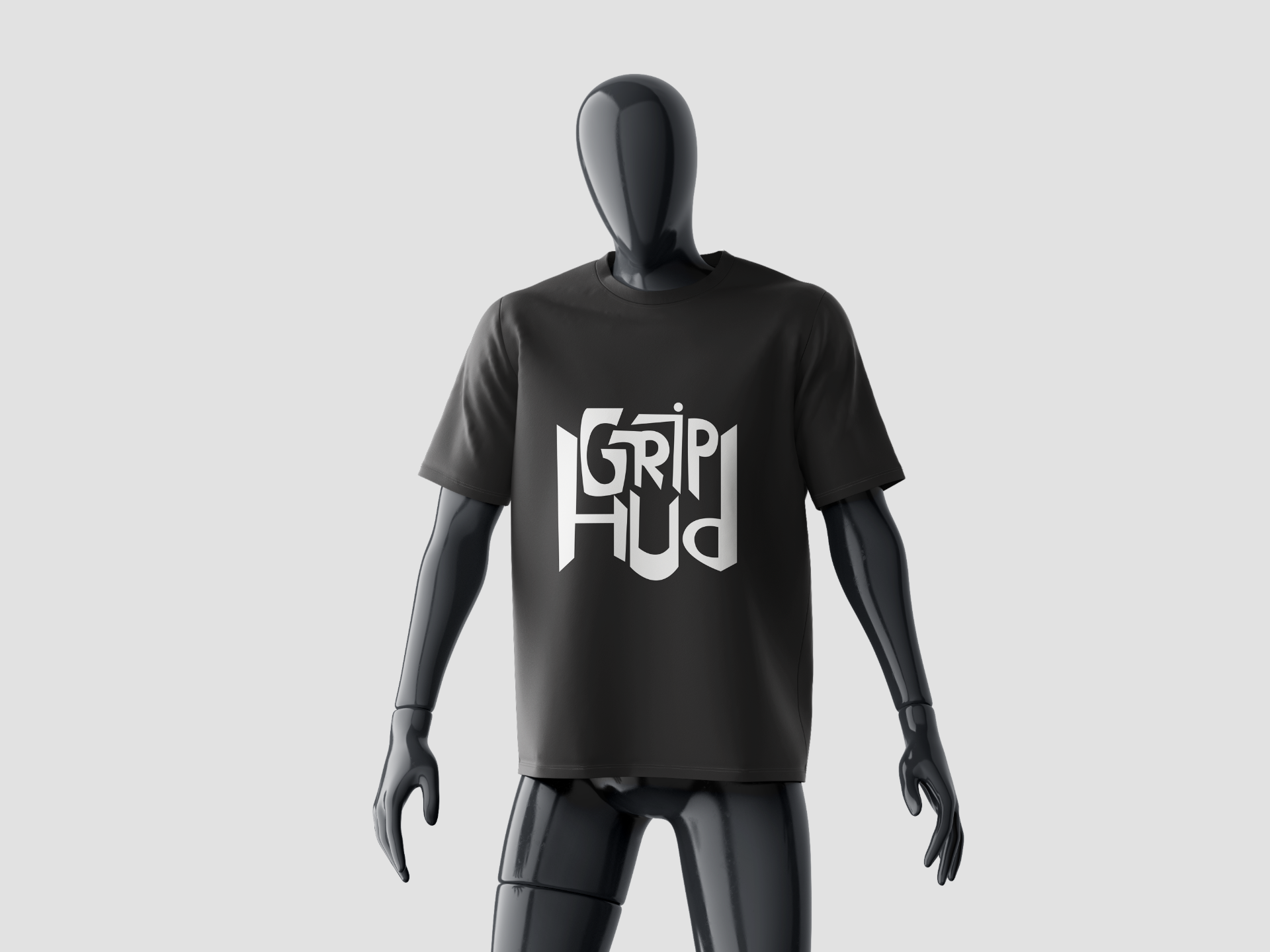
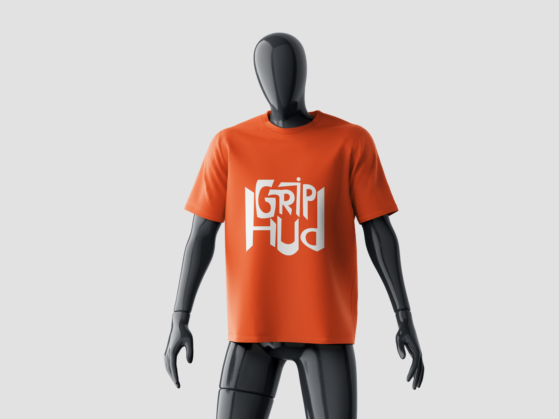
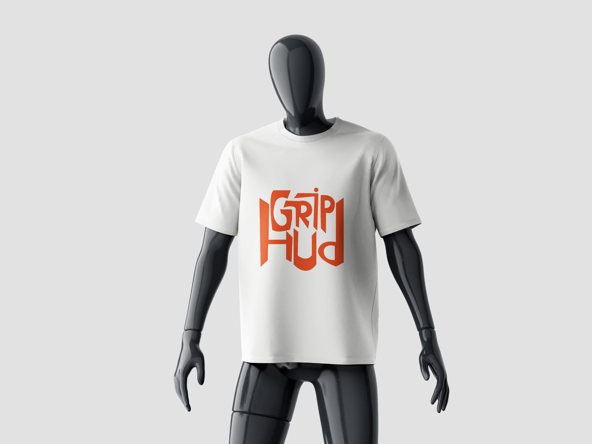
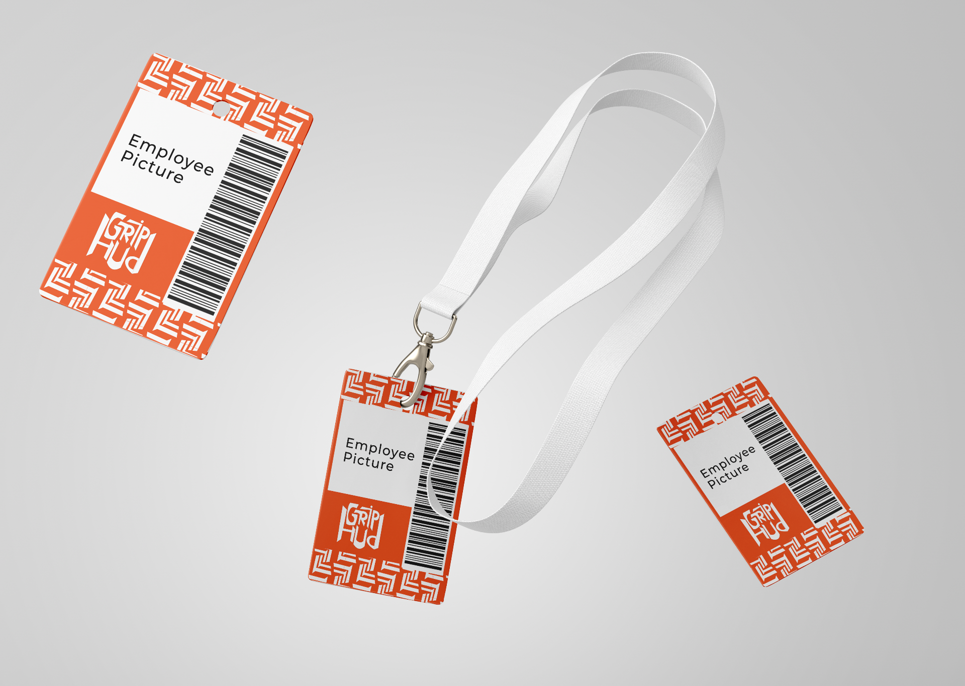
The Grip Hub identity system combines bold geometric forms with flexible logo variations designed for digital platforms, merchandise, signage, and environmental applications. The system balances energy, movement, and clarity while remaining instantly recognizable across every touchpoint.
Color Palette
Orange
#F15A29
White
#FFFFFF
Charcoal
#353434
Typography
DISPLAY & WORDMARK
Grandstander
Used for the Grip Hub logo, wordmarks, headlines, large titles, hero sections, and key brand elements. Chosen for its bold, energetic personality that captures the excitement and movement of the climbing community.
ABCDEFGHIJKLMNOPQRSTUVWXYZ
abcdefghijklmnopqrstuvwxyz
0123456789
BODY & SUPPORTING TEXT
Montserrat Regular
Used for body text, paragraphs, UI elements, supporting copy, and case study descriptions. Chosen for its clean readability and modern appearance, providing balance and clarity across digital and physical brand touchpoints.
ABCDEFGHIJKLMNOPQRSTUVWXYZ
abcdefghijklmnopqrstuvwxyz
0123456789
Mockups
Final Outcome
Grip Hub emerged as a bold and energetic identity system that captures the spirit of climbing, movement, and progression. Through a flexible logo suite, a high-contrast color palette, and a distinctive visual language, the brand creates a memorable experience that feels welcoming to beginners while inspiring more experienced climbers. The identity is designed to scale seamlessly across merchandise, signage, digital platforms, and the physical climbing environment.